Preview image. Unlock full-res
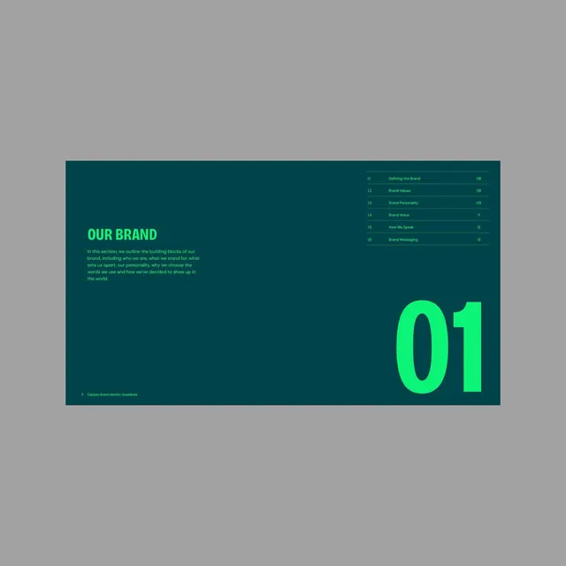
A brand identity guideline opening page pairs a dark teal ground with neon green typography, using high contrast and oversized numerals to frame the brand narrative.
Summary
A brand identity guideline opening page pairs a dark teal ground with neon green typography, using high contrast and oversized numerals to frame the brand narrative.
Visual description
Dark teal background. Upper left: "OUR BRAND" in green sans-serif caps, followed by three lines of body copy in muted green describing the brand mission and values. Right edge: a structured table of contents in grey text on dark teal, listing numbered sections (1.1 through 1.6) with headings like "Defining the Brand", "Brand Values", "Brand Personality". Lower right: a dominant oversized "01" in neon green, commanding the lower third of the page. Bottom left corner: fine attribution text in grey.
Key takeaway
The neon green–on–dark-teal contrast creates immediate visual pop without sacrificing legibility; a single accent color doing all the work. Oversized numerals ground each section and act as visual anchors that organize the content spatially. The restrained green palette (muted in body copy, bright in display elements) shows discipline and creates a visual hierarchy that guides the eye from narrative to structure.
Reuse notes
Ideal for corporate brand guidelines where a bold accent color signals innovation while dark tones maintain authority. Works for tech, fintech, or progressive B2B brands. The geometric number approach scales well across multi-page guideline systems.
More like this




Keep what you find
A free account saves references to boards and can send you a weekly email of picks based on what you save.
To see every result, go Pro.