Preview image. Unlock full-res
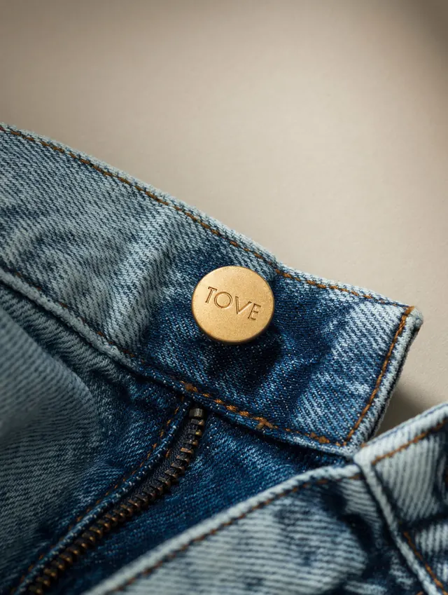
Comprehensive brand identity for Tove studio encompassing logo, fashion mockups, collateral items, and lifestyle photography across 12 slides with video component.

Summary
A complete brand system for Tove Studio spanning logo refinement, fashion garments, packaging, print collateral, and lifestyle imagery, unified by warm neutral tones and deliberate minimalist typography.
Visual description
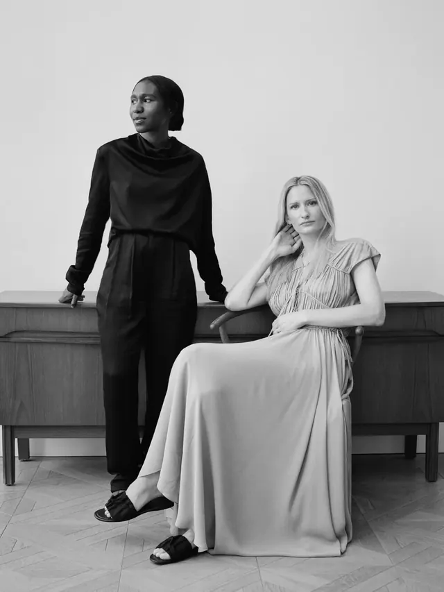
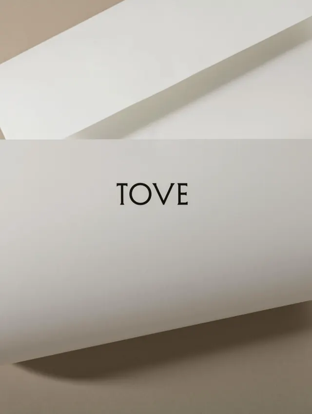
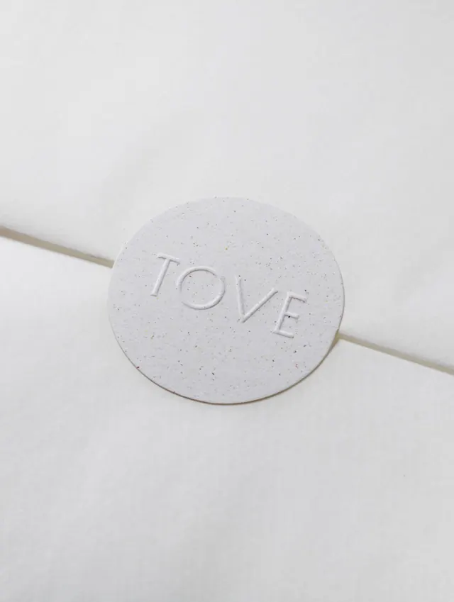
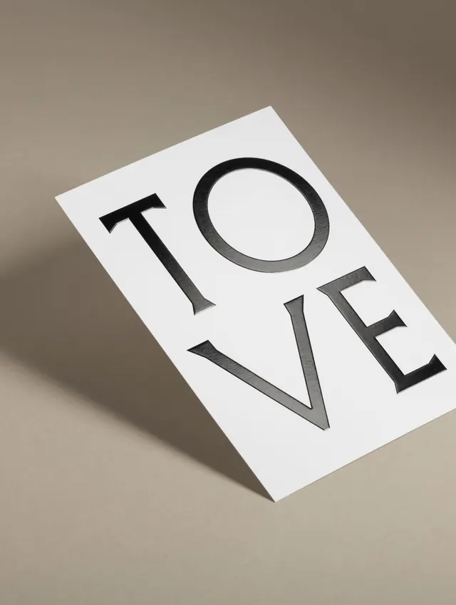
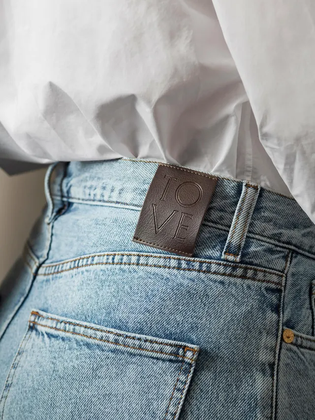
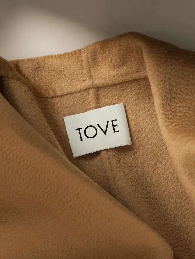
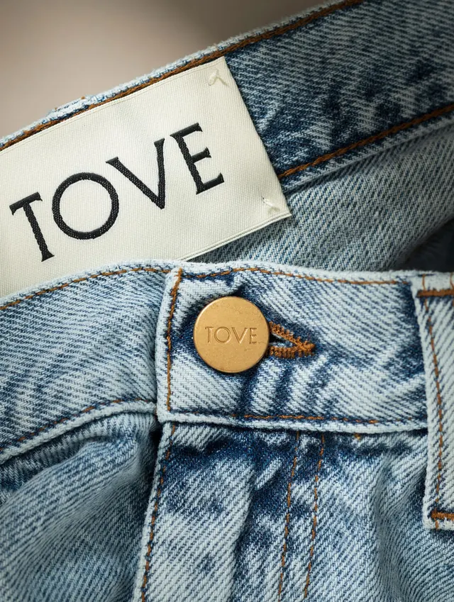
Slide 1: Video component (poster frame shows textile/garment detail). Subsequent slides show: a clean text-based logo with serif detailing; models wearing draped lavender and neutral-toned garments photographed against dark backgrounds; a napkin or small item with "TOVE" embossed; heart-shaped and card-format branded collateral; a leather belt or accessory with buckle hardware; wool fabric swatches in neutral tones; black-and-white lifestyle photography of subjects in studio dress; text and typographic mark exploration; and close-up detail of material and embossing. Throughout, a consistent aesthetic of premium materials, muted color, and refined typography creates a cohesive luxury brand presence.
Key takeaway
The discipline of extending a minimal logo and typographic system across diverse physical touchpoints-from garments to packaging to accessories-without dilution. The warm, tonal photography style unifies disparate materials and scales, demonstrating that constraint in color and mood strengthens a multi-media brand identity.
Reuse notes
Excellent reference for luxury fashion, lifestyle, or materials-focused brands. The balance of serif typography with clean sans-serif hierarchy is particularly strong for upscale positioning. The warm neutral palette and soft photography style work well for clothing, home goods, and beauty brands. The restraint in color palette and composition creates premium positioning without relying on bright color or heavy ornamentation.
From this post: Tove brand identity system carousel with fashion and collateral
View post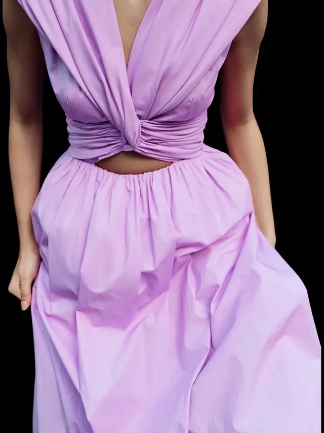


More like this


Keep what you find
A free account saves references to boards and can send you a weekly email of picks based on what you save.
To see every result, go Pro.