Preview image. Unlock full-res
An 8-slide carousel revealing Papaton's animated-character studio branding, centered on a playful anthropomorphic mascot and a typographic identity rooted in motion principles.

Summary
A motion-design carousel unveiling Papaton, an animation studio whose identity embodies animation principles themselves. A playful white-and-cream bird character wearing the studio's name on its hat anchors a system where typography stretches, compresses, and springs into motion.
Visual description
Opening slides introduce a simple, charming anthropomorphic character, a goose or crane with a cream body, orange beak, and a white baseball cap inscribed with "PAPATON" in bold black sans-serif. Against a clear sky-blue background, the character is rendered with soft volumes and a friendly expression. Subsequent slides show the identity system applied to various materials: a paper-fold diagram illustrating how the character's head shape echoes a stylized "P", type treatments where letters squash and stretch (implying bounce and movement), color variations, and pattern applications. Later slides feature motion sequences and animated iterations of the logo.
Key takeaway
Animation principles (stretch, squash, bounce) embedded into static typography creates an inherent sense of motion and personality. The mascot character is memorable, ownable, and translatable across media. Simple color palette (cream, orange, blue) is timeless and approachable.
Reuse notes
Excellent for animation studios, children's media, or any brand where playfulness is core. Character-led identities require significant investment in illustration and animation, but the payoff in memorability and social reach is high. The system is modular enough to live on social, in presentations, and on physical collateral. Blueprint/process storytelling (showing how the character connects to letterforms) adds depth and educational appeal.
From this post: Papaton studio identity and animated character system
View post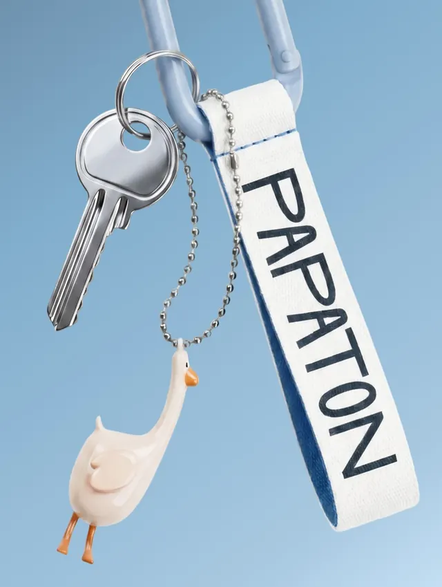
More like this
Keep what you find
A free account saves references to boards and can send you a weekly email of picks based on what you save.
To see every result, go Pro.