Preview image. Unlock full-res
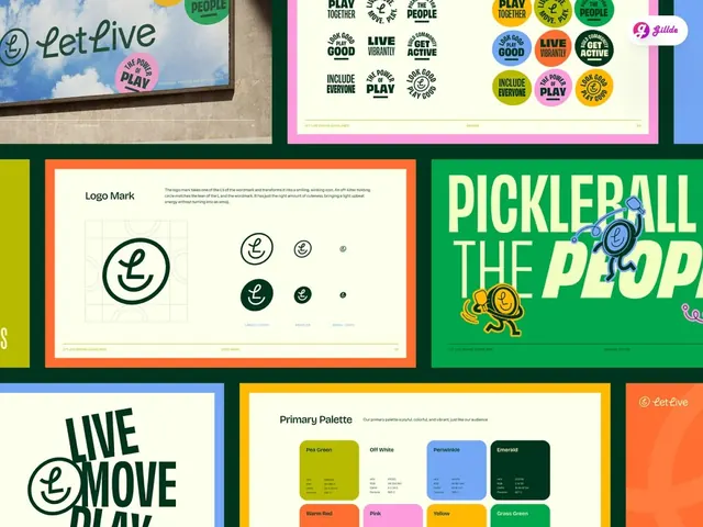
Community-sport brand showing a smiley L-monogram and a grid of slogan-badge stickers, anchored in forest green and pea green with chunky display type.
Summary
A pickleball-community brand system pairing a friendly smiley-L monogram with a dense grid of circular badge stickers carrying different slogans, bound by forest green and pea green against cream.
Visual description
The presentation spreads across six panel boards in a bold colored grid. Top left shows a billboard-scale rendering of the Let Live wordmark with round sticker badges scattered on a blue-sky photograph. Top right grids ten circular stickers on a pink border, each carrying a different slogan (PLAY GOOD, LIVE ACTIVE, INCLUDE EVERYONE) in black hand-drawn lettering, colors ranging across forest green, pea green, yellow and blue. Center-left, an orange-bordered construction board documents the logo mark: a chunky smiley-face outline where the curved L itself becomes the mouth, shown at three sizes (full, medium, small) with reference dots and a subtle grid. Right of center, a bright kelly-green board runs PICKLEBALL THE PEOPLE in stacked, condensed all-caps display type with a mascot character bouncing between the words. Bottom left shows bold LIVE MOVE PLAY stacked lockups; bottom right displays a Primary Palette page with named color swatches (Pea Green, Off White, Periwinkle, Emerald, Warm Red, Pink, Yellow, Grass Green) each labeled with hex and RGB code values. Forest green and pea green ground every board; off-white provides breathing room.
Key takeaway
The smiley-L is a single gesture that works at any size and reads both as a monogram and as a personality. Showing it on a construction grid with reference sizes instantly conveys professionalism without losing charm. Anchoring dozens of badge variations (different slogans, all hand-drawn lettering) gives the system both energy and precision. Named, value-stamped color swatches feel like an actual brand spec, not a mood board.
Reuse notes
A strong reference for sports, fitness, community or event identities that need to project both fun and credibility. Works best when you have many slogans or messaging variations to fill the badge grid. The rounded sans and chunky display type pair well with the geometric logo. Watch the swatch card density if you have fewer than eight colors; the system needs fullness to sing.
More like this

Keep what you find
A free account saves references to boards and can send you a weekly email of picks based on what you save.
To see every result, go Pro.