Preview image. Unlock full-res
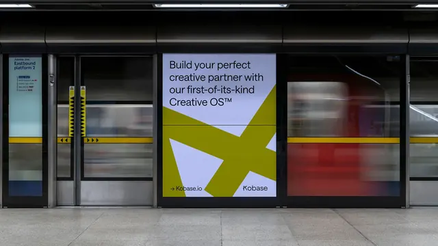
An underground platform advertising panel showing a lavender Kobase poster with a huge cropped olive-green asterisk under a black grotesque headline.
More like this
See all
Summary
A single Kobase poster photographed in place on a dark underground platform, its pale lavender panel and oversized acid-olive asterisk cutting hard against the surrounding metal and glass.
Visual description
The frame is a wide photograph of a station platform. Along the left edge a lit sign reads "Jubilee line Eastbound platform 2" above a small vertical list of onward stops. Full-height glass platform-edge doors run across the shot with a yellow safety band at waist height and black-and-yellow hazard chevrons on the door posts; behind the glass a train is a smear of red, blue, and grey motion blur. The floor is grey speckled stone and the ceiling structure is near black. Set into the door bay just right of centre is a portrait poster panel filling most of the frame height. Its ground is a pale lavender grey. A single enormous olive-green asterisk, closer to a six-armed star of thick tapered blades, is cropped so hard by the panel that only its central junction and four arms remain, the arms running off the left, right, and bottom edges. Above it, ranged left in three lines, sits the headline "Build your perfect creative partner with our first-of-its-kind Creative OS" in black grotesque with tight leading and a small raised trademark symbol. A thin black hairline rule crosses the full panel width at roughly the vertical middle, passing straight over the green form. At the bottom, an arrow glyph and "Kobase.io" sit at the left and the "Kobase" wordmark sits at the right, both in the same black type. The poster is the brightest surface in the photograph.
Key takeaway
Cropping the symbol until it is unreadable as a whole shape is what gives the poster its scale: the arms running off three edges imply a mark far larger than the panel. The hairline rule is the quiet counterweight, dividing headline from mark and proving the layout sits on a system rather than floating. Photographing it in a dark, visually noisy transit environment shows the brand's value contrast doing real work.
Reuse notes
Use this when a brand needs to prove a flat two-colour system survives out of home, or when a single geometric mark has to fill a portrait format without repeating into a pattern. The composition depends on a light poster ground against a dark surround, so it will not read the same on a bright outdoor site. The bottom row splits url and wordmark to opposite corners, which is clean at poster scale but would crowd at small sizes.