Preview image. Unlock full-res
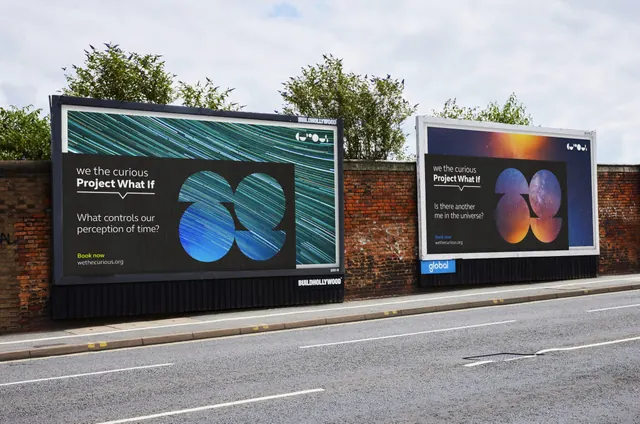
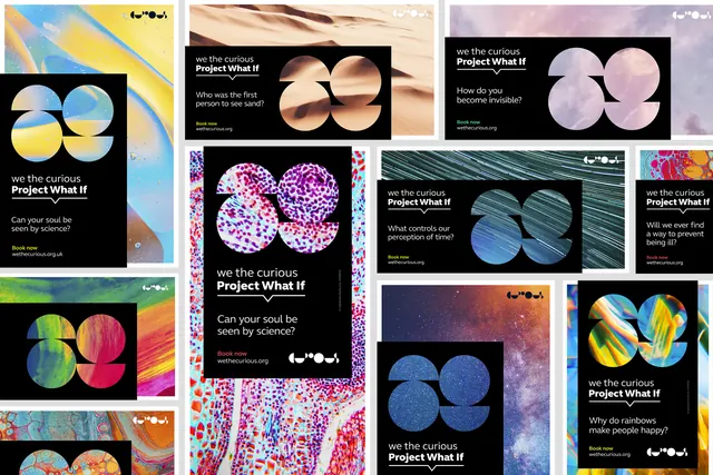
Two roadside billboards for a science centre exhibition, each pairing a black question panel with a four-circle monogram filled with macro photography.
More like this
See all
Summary
An in-situ shot of two adjacent billboards on a brick wall, each running the same template: a black panel of question copy sitting over a full-bleed macro image, with a four-circle monogram cut out of that same image.
Visual description
The photograph looks along a pavement wall, with two hoardings set at different depths. Both posters use one system. A full-bleed abstract photograph fills the sheet, a black rectangle is dropped over roughly the lower two thirds and left half, and a large geometric monogram built from four overlapping circles sits on the right, filled with the underlying photograph so the image reads through the letterforms. Inside the black panel, small lowercase "we the curious" sits above a heavier "Project What If", underlined by a thin rule that dips into a downward chevron. A two-line question follows in light sans, then a yellow "Book now" and a white url. The left board uses teal and blue star-trail streaks with "What controls our perception of time?"; the right uses an orange and violet nebula with "Is there another me in the universe?". A small white pictogram mark sits in the top right corner of each sheet. Red brick, greenery and a wet grey road frame the boards.
Key takeaway
One rigid template plus an infinitely swappable image well: the black copy panel and the monogram never move, and the campaign gets its variety entirely from the photograph behind them. Filling the monogram from the same image that fills the sheet locks mark and artwork together without any second color.
Reuse notes
A strong reference for a poster or out-of-home campaign that needs many executions from one layout, especially for exhibitions, festivals and museums. Depends on a genuinely rich picture library; with weak imagery the black panel would dominate and the monogram would go muddy. The chevron rule under the lockup is the piece of detail that keeps the panel from looking generic.