Preview image. Unlock full-res
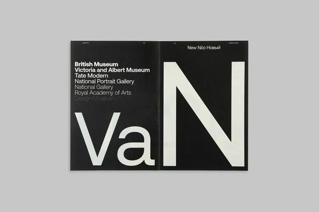
An open-spread typographic composition with cream-colored letterforms Va and N each occupying a full page on black background, with exhibition venue listings on the left.
Summary
A two-page editorial spread featuring large cream-colored letterforms Va and N on separate black pages, with a vertical list of institutional venues aligned on the left.
Visual description
An open book view displaying two facing pages, each with a single oversized cream or ivory letter: Va on the left page, N on the right. The letters are monumental in scale and centered within the black background. The left page bears a column of white text listing major institutions: British Museum, Victoria and Albert Museum, Tate Modern, National Portrait Gallery, National Gallery, Royal Academy of Arts, and others. Running headers and page numbers appear at the top margins, with typography specifications noted.
Key takeaway
The drama of extreme typographic scale combined with institutional authority achieved through spare, high-contrast design. The asymmetric spread layout (text on left, negative space on right) creates a striking power balance.
Reuse notes
Excellent reference for museum exhibition catalogues, cultural institution branding, and editorial design systems. The model works particularly well for announcing exhibitions or collections where institutional credibility and typographic hierarchy are paramount. The split composition can accommodate variable amounts of supporting information.
More like this
Keep what you find
A free account saves references to boards and can send you a weekly email of picks based on what you save.
To see every result, go Pro.