Preview image. Unlock full-res
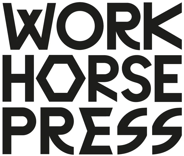
A black-on-white logotype reading WORK HORSE PRESS in three justified lines of a custom geometric sans, with a hexagonal O and angular cuts on K, R, and S.
Summary
A three-line, all-caps wordmark spelling WORK / HORSE / PRESS in a heavy custom geometric sans, set in solid black on white. The signature detail is the hexagonal counter inside the O of HORSE, which doubles as a nut-and-bolt nod to the "workhorse" name.
Visual description
The three words stack tightly with each line set to the full column width, so the letterforms stretch and the right edges align into a hard block. The letterforms are heavy and monolinear with distinctive cuts: the K and R legs end in sharp diagonal shears, the S has flat clipped terminals, and the W is built from straight strokes meeting in points. The middle line's O is replaced by a hexagon, the one curved counter broken on purpose. Pure black ink on a plain white ground, no color, no secondary marks.
Key takeaway
Justifying each word to the same width turns a plain stacked logotype into a tight architectural block. Swapping a single round counter for a hexagon plants a literal meaning (a bolt, machinery) inside an otherwise geometric system without adding an icon.
Reuse notes
Strong fit for a print shop, risograph studio, workwear brand, or any "industrious" identity. The custom shears mean it needs to be drawn, not typed, so treat it as a logotype rather than a font choice. Works at large sizes; the hexagon detail will disappear if shrunk to favicon scale.
More like this

Keep what you find
A free account saves references to boards and can send you a weekly email of picks based on what you save.
To see every result, go Pro.