Preview image. Unlock full-res
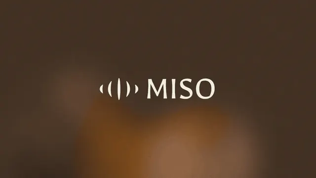
Miso combines a minimalist sound wave icon with a clean sans-serif wordmark on a warm brown gradient background.
Typesans-serif
Moodprofessional, calm, elegant
Industryfood, healthcare, saas
Tagssound waves, minimal design, geometric icon, Japanese cuisine, audio branding, One word, Abstract, Letterform, Wave, Sans-Serif, symbol-text, wordmark: MISO, monochromatic, warm, orange
Palette
#433024
#744D2E
#927156
Summary
Miso combines a minimalist sound wave icon with a clean sans-serif wordmark on a warm brown gradient background.
Visual description
A white logo consisting of a symbol and the word MISO in a sans-serif typeface. The symbol features three pairs of curved vertical lines of varying lengths, resembling sound waves. The entire logo is centered on a dark brown gradient background.
Key takeaway
Use symmetrical, concentric curved lines to visually represent sound or frequency.
Reuse notes
Reach for this when designing a logo for food & drink, health & wellness. Pairs with modern, minimal identity systems. Original by Drice Roland.