Preview image. Unlock full-res
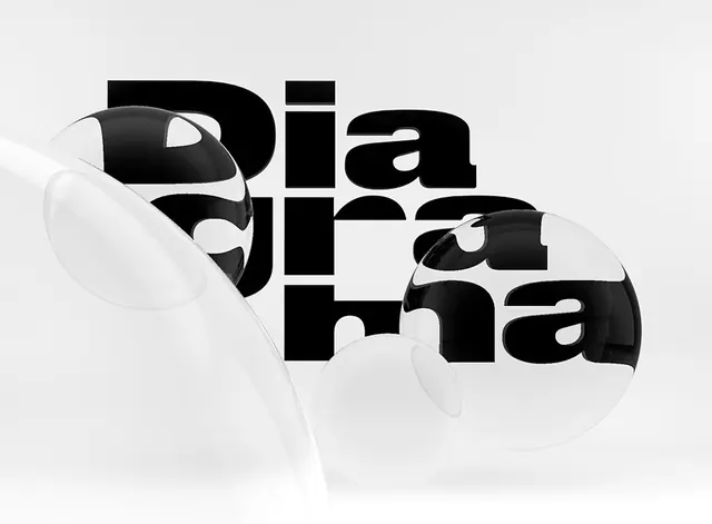
Bold black display typography spelling "dia" with geometric overlapping circles and organic shapes in white and transparent layers on minimal background.
Summary
A minimalist wordmark for "Dia" in bold black display type, overlaid with geometric white circles and organic curved shapes creating a layered, interactive composition.
Visual description
Large bold black letters spelling "dia" occupy the center and right of the composition. Over and around the letters, white and semi-transparent circular and curved shapes interact—some circles are placed partially over letters, others sit independently. The background is a neutral pale off-white, allowing the pure black type and white geometric elements to create a striking two-color study.
Key takeaway
Layering geometric shapes over typography creates sophistication and visual interest without added complexity—each shape serves the composition, not decoration.
Reuse notes
Reference for logo design, branding systems, or typographic exploration. Strong for contemporary design studios, creative agencies, or any brand wanting a mark that's both bold and refined.
More like this





Keep what you find
A free account saves references to boards and can send you a weekly email of picks based on what you save.
To see every result, go Pro.