Preview image. Unlock full-res
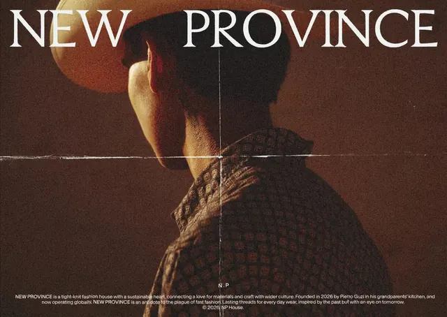
Editorial promotional poster for New Province, a sustainable fashion brand, featuring a photographed figure in textured knitwear with bold serif typography and geometric overlays.
Summary
A fashion brand promotional poster for New Province featuring a photographed figure from behind wearing a textured knit garment, with the brand name "NEW PROVINCE" rendered in large serif capitals overlaid across the top, complemented by geometric circular forms and thin linear elements.
Visual description
Dark earthy background in warm browns and rust tones. A figure photographed from behind wearing a textured, patterned knit garment visible from approximately the shoulders down. Two circular geometric forms—one larger and warmer in the upper left area, one smaller and darker behind the figure—anchor the composition. Thin vertical and horizontal lines create a subtle grid overlay. The brand name "NEW PROVINCE" appears in large white serif type at the top in a spaced, display treatment. Below the figure, body copy explains the brand's founding story and sustainable philosophy. A small "N.P" logo mark appears centered near the bottom. The overall palette is limited to dark browns, warm golds, and cream tones with white typography.
Key takeaway
Photography anchored by oversized serif typography and subtle geometric overlays creates editorial sophistication. The spare use of geometric elements (circles and lines) adds visual interest without overwhelming the fabric texture and figure. Restraint in color range creates cohesion and premium feel.
Reuse notes
Excellent reference for high-end fashion or apparel brand promotions. Works particularly well for brands emphasizing craftsmanship, sustainability, or heritage positioning. The geometric overlay technique pairs well with textile or material photography. Best suited to digital and print contexts targeting design-conscious audiences. The serif typography suggests established, timeless positioning.
More like this

Keep what you find
A free account saves references to boards and can send you a weekly email of picks based on what you save.
To see every result, go Pro.