Preview image. Unlock full-res
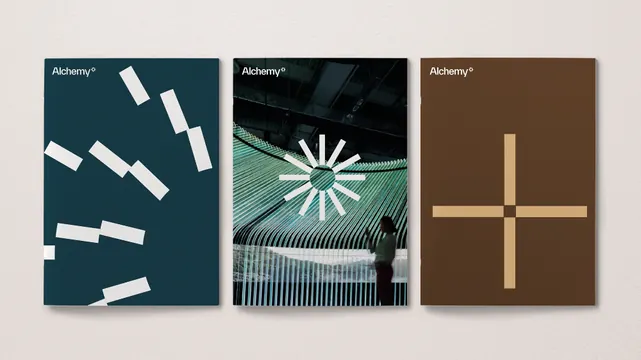
A three-panel study in abstract geometric minimalism, using diagonal lines, radial sunburst marks, and simple crosses rendered in muted earth and warm tones against dark teal, black, and warm brown backgrounds.
Summary
Three distinct abstract compositions arranged as a triptych, each exploring a single geometric motif: diagonal dashes on teal, a radial sunburst on black, and a simplified cross on warm brown. The restraint and high contrast across all three creates visual sophistication through systematic minimalism.
Visual description
The left panel uses a deep teal background with white diagonal dashes arrayed loosely, suggesting movement or fragmentation. The center panel features a black ground with cream concentric arcs radiating outward from a central point, creating a sunburst or focal-gaze effect. The right panel is a warm chocolate-brown with a simple cream or light-tan cross rendered in thick, even lines. All three sections employ pure colors and white accents, with generous negative space allowing each geometric motif to read clearly. The overall composition is balanced and calm, with no text or decorative elements competing for attention. The palette oscillates between cool (teal) and warm (brown) tones, united by the use of muted cream and neutral accents.
Key takeaway
Single-geometric-motif studies reduce branding elements to their essence, making them versatile for application across contexts. The triptych format shows three distinct identity expressions from a unified design language, useful for presenting multiple variations on a core mark. The color progression from teal through black to brown demonstrates how the same geometric idea adapts to different palettes while maintaining sophistication.
Reuse notes
Use as inspiration for luxury packaging, stationery systems, or editorial design where minimalism reads as intentional refinement. The geometric marks work well as secondary patterns (letterpress textures, embossed backgrounds, foil details) rather than as primary logos. Consider adapting the triptych concept to show a mark in three different colorways or at different scales. The muted earth palette (teal, brown, cream, charcoal) pairs well with premium materials (kraft, linen, foil). Avoid adding complexity; the power lies in the simplicity and the quality of the whitespace.
More like this




Keep what you find
A free account saves references to boards and can send you a weekly email of picks based on what you save.
To see every result, go Pro.