Preview image. Unlock full-res
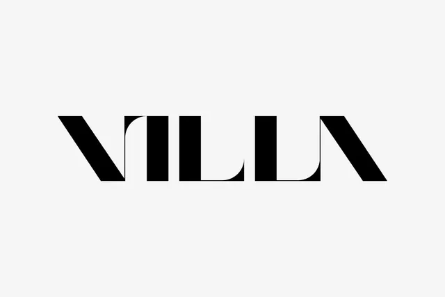
Minimalist black wordmark with curved letterforms on a light background, featuring negative space cuts in the letters for a modern, architectural feel.
Summary
A monochromatic wordmark spelling "VILLA" in a bold, geometric sans-serif with subtle curved cuts and negative space integration, positioned centrally on a light cream background.
Visual description
The word "VILLA" is rendered in thick, black, geometric sans-serif letters set on a soft off-white background. Each letter is constructed from clean, architectural forms with sharp angles and subtle curves. Several letters feature negative space—curved cutouts in the letters that suggest movement and sophistication. The letters are evenly spaced and appear to have consistent weight throughout. The overall impression is refined and modern, with an architectural sensibility. No additional graphics or embellishments are present.
Key takeaway
Negative space cuts in letters elevate a simple wordmark from flat to sophisticated. The balance of thick forms and delicate cutouts creates visual interest while maintaining legibility. Clean geometry reads as premium and modern without any decorative excess.
Reuse notes
Ideal for luxury, architectural, or real estate brands seeking a minimalist identity. The technique works best at large display sizes where the negative space details read clearly. Works equally well in single color or reversed. The geometric forms suggest movement and innovation without feeling trendy.