Preview image. Unlock full-res
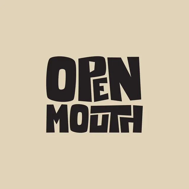
Bold, chunky two-line wordmark with geometric letterforms and negative space cutouts creating a playful, expressive visual style.

Summary
Bold, chunky two-line wordmark with geometric letterforms and negative space cutouts creating a playful, expressive visual style.
Visual description
The logo features the words OPEN MOUTH in a heavy, distorted black sans-serif typeface on a beige background. The letters are chunky and irregular, with the word OPEN stacked above MOUTH. The overall shape forms a rough rectangle with slightly curved edges.
Key takeaway
Use exaggerated, irregular letterforms to create a tactile, organic feel. Vary the weight and width of characters to add visual tension.
Reuse notes
Reach for this when designing a wordmark for food & drink, media & entertainment. Pairs with playful, bold identity systems. Original by Jack Watson.