Preview image. Unlock full-res
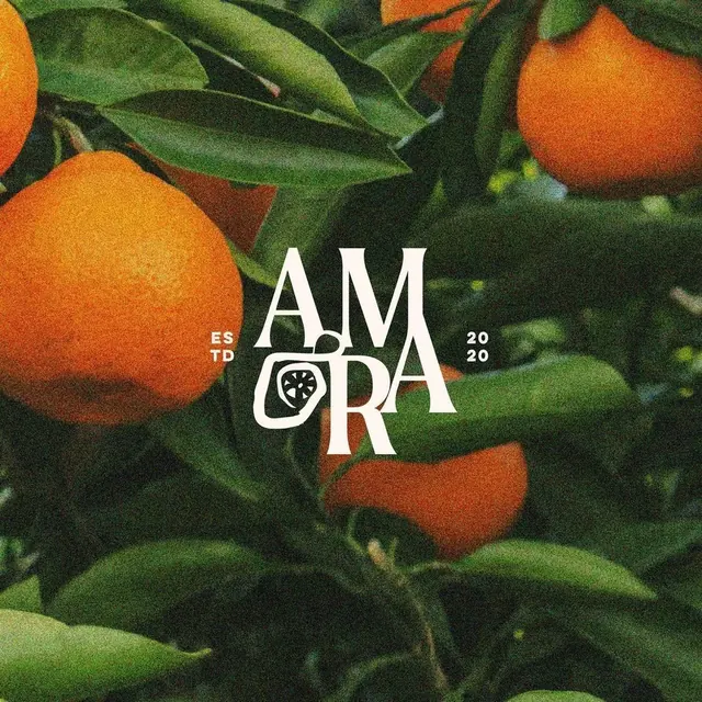
Bold white wordmark with integrated citrus fruit icon, designed for a fresh and natural brand aesthetic.
Stylegeometric
Typesans-serif, all-caps, serif
Moodprofessional, friendly, energetic, bold
Industryfood, healthcare
Tagscitrus, lemon, organic, fresh, fruit branding, icon integration, One word, Food, Circle, Letterform, Nature & Plant, Sans-Serif, Bold, Uppercase, Unique, wordmark, wordmark: AMORA, complementary, warm, green, orange
Palette
#4B692D
#364D25
#1C2318
#2A3720
#D76B1B

Summary
Bold white wordmark with integrated citrus fruit icon, designed for a fresh and natural brand aesthetic.
Visual description
A white serif wordmark reads AMORA, split into two lines with AM above RA. The letter O is replaced by a circular emblem containing a stylized four-petaled flower. Small white text reads ESTD 2020 flanking the central letters.
Key takeaway
Replace a central vowel in a wordmark with a geometric symbol to create a focal point.
Reuse notes
Reach for this when designing a wordmark for food & drink, e-commerce & dtc. Pairs with modern, friendly identity systems. Original by Astir Studio.