Preview image. Unlock full-res
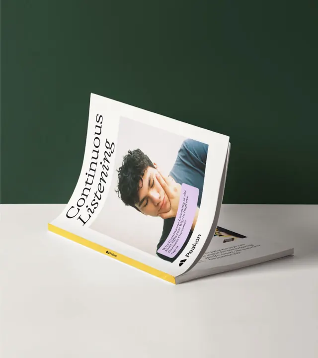
Printed "Continuous Listening" magazine propped open in a V against a dark green backdrop, its yellow spine and cover typography catching the light.
More like this
See all
Summary
A printed magazine standing open on its own weight, shot at an angle so the cover, the spine colour and an inside page are all readable in one frame.
Visual description
Portrait photograph. A deep forest green wall meets an off-white tabletop on a soft horizon roughly a third down the frame. A saddle-stitched magazine stands propped open in a shallow V, front cover facing the camera and curling gently away, back pages splayed flat to the right. The cover reads "Continuous Listening" in a large upright serif that runs vertically up the left edge because of the rotation, with a portrait photograph of a young man resting his cheek on his hand filling the right two thirds. A lilac rounded-corner card overlaps the photograph carrying a small italic article title and a page reference, echoed by the Peakon mark and wordmark at the lower right of the cover. A saturated amber yellow strip runs the length of the spine and folded edge, with a tiny Peakon lockup repeated along it. Body text on the exposed inside page is visible but not legible at this scale. Lighting is soft and directional from the upper left, and the shadow under the magazine is short and diffuse.
Key takeaway
Standing a stitched publication open in a V instead of laying it flat lets one photograph carry the cover, the interior and the spine colour at once. The bright spine is the detail that does the most work here, turning an otherwise quiet cover into a piece of brand colour.
Reuse notes
Good template for presenting a printed report or in-house magazine in a case study or a portfolio grid. Needs a matte stock and controlled soft light to hold the curl without glare, and a backdrop colour that contrasts with the cover rather than the spine. The rotated cover type reads best when the headline is short.