Preview image. Unlock full-res
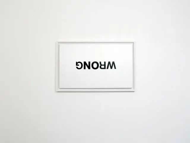
A minimalist wordmark in which the word "WRONG" is inverted 180 degrees within a gray rectangular frame, appearing as "GNOHW" when viewed normally.
Summary
A minimalist wordmark where "WRONG" is inverted 180 degrees, reading as "GNOHW" when viewed straight on. The black sans-serif text is centered in a thin gray rectangular frame on a white background.
Visual description
A light gray rectangular frame centered on a light gray background. Inside the frame, against white, sits a bold black sans-serif word in all capitals, flipped upside-down. When inverted, the letters spell "WRONG"; when viewed normally, they spell "GNOHW." The text is horizontally centered and occupies roughly the middle third of the frame's height.
Key takeaway
The inversion is the primary concept—the wordmark reveals its meaning only when flipped, creating a playful tension between what you see and what you should read. The minimal framing and monochrome palette emphasize this typographic idea without distraction.
Reuse notes
Strong for portfolios, creative agencies, and design studios seeking conceptual or unconventional branding. The inversion gimmick works well on printed materials and digital applications where the orientation can be controlled. Not ideal for applications where the piece may be viewed at unpredictable angles.
More like this




Keep what you find
A free account saves references to boards and can send you a weekly email of picks based on what you save.
To see every result, go Pro.