Preview image. Unlock full-res
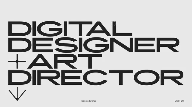
A minimalist typographic poster featuring the text 'DIGITAL DESIGNER + ART DIRECTOR' arranged in a stacked, justified block format.
Summary
A minimalist typographic poster featuring the text 'DIGITAL DESIGNER + ART DIRECTOR' arranged in a stacked, justified block format.
Visual description
The design uses heavy, black sans-serif lettering set against a light gray background. The text is arranged in a tight, justified block where characters overlap or touch, creating a dense typographic texture. A small plus sign and a downward-pointing arrow are integrated into the layout.
Key takeaway
Using oversized, condensed sans-serif type in a justified block creates a strong, architectural visual impact.
Reuse notes
Use this style for personal branding, portfolio covers, or impactful event posters where typography is the primary visual element.
More like this
Keep what you find
A free account saves references to boards and can send you a weekly email of picks based on what you save.
To see every result, go Pro.