Preview image. Unlock full-res
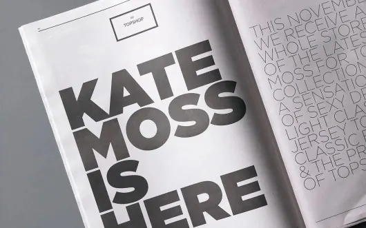
Editorial magazine spread featuring large all-caps headline "KATE MOSS IS HERE" with accompanying body text columns, printed on white paper in monochromatic design.
Summary
A monochromatic editorial magazine spread featuring a bold, oversized all-caps headline "KATE MOSS IS HERE" paired with justified body text columns in a clean, modern layout.
Visual description
A spread from a printed magazine or publication on white paper. The left page features a thick sans-serif headline in all-caps reading "KATE MOSS IS HERE" in black ink, occupying roughly half the vertical space. To the right are multiple narrow columns of smaller body text in the same sans-serif family, justified and neatly organized. A small label or header text appears above the headline. The overall composition uses pure black type on white paper with ample white space, creating a sophisticated, high-contrast editorial layout typical of contemporary design or typography-focused publications.
Key takeaway
Oversized headlines paired with disciplined text columns create visual hierarchy without color or imagery. The scale contrast between headline and body text guides the viewer's attention while the justified columns maintain structured elegance.
Reuse notes
Excellent reference for editorial design, magazine layouts, and print-based publication design. The all-caps, high-contrast approach works well for feature articles, fashion editorials, or cultural publications. The clean monochromatic treatment is cost-effective for printing and pairs well with photography or illustration when needed. Strong template for modern typography-led design systems.
More like this



Keep what you find
A free account saves references to boards and can send you a weekly email of picks based on what you save.
To see every result, go Pro.