Preview image. Unlock full-res
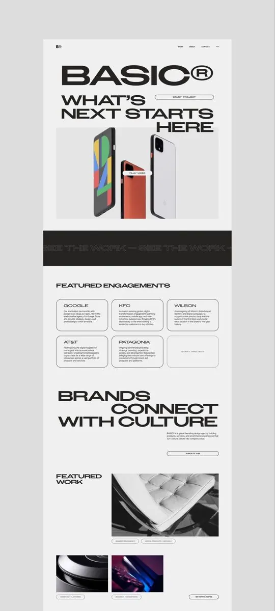
A long-scroll homepage for design agency BASIC built on oversized black condensed headlines, a phone-mockup hero, a bordered engagement grid, and a marquee strip.
Summary
A full-length homepage screenshot for the agency BASIC, organized top to bottom around enormous black condensed-sans headlines on near-white. A phone-mockup hero, a bordered three-column engagement grid, and a scrolling marquee carry the rest.
Visual description
The page opens with a small "B" logo and a thin nav, then a giant "BASIC" wordmark with a registered mark, followed by "WHAT'S NEXT STARTS HERE" in oversized condensed caps. The hero shows three angled Google Pixel phone mockups (multicolor, orange, white) with a small "PLAY VIDEO" pill. A black band carries a faint outlined marquee reading "SEE THE WORK." Below, a "FEATURED ENGAGEMENTS" section is a three-column grid of thin-bordered cards (Google, KFC, Wilson, AT&T, Patagonia, plus a "START PROJECT" cell). Another oversized headline "BRANDS CONNECT WITH CULTURE" leads into a "FEATURED WORK" block with grayscale and dark project thumbnails tagged by category. The palette is almost entirely greyscale with restrained accents.
Key takeaway
Letting one or two oversized condensed headlines per section dominate the page so type, not imagery, sets the rhythm of a long scroll. Thin-outlined, equal-size cards in a tidy grid make a client roster read as a system rather than a logo dump. A faint outlined marquee band is a low-key way to break the white sections without adding color.
Reuse notes
A solid blueprint for a design or branding agency homepage that wants to feel confident and editorial on a near-monochrome palette. The look depends entirely on a strong condensed display face and genuinely large type; timid sizing collapses the whole effect. Pair the bordered grid with high-quality case-study thumbnails, since the muted palette gives those images all the color in the layout.
More like this







Keep what you find
A free account saves references to boards and can send you a weekly email of picks based on what you save.
To see every result, go Pro.