Preview image. Unlock full-res
Visual description
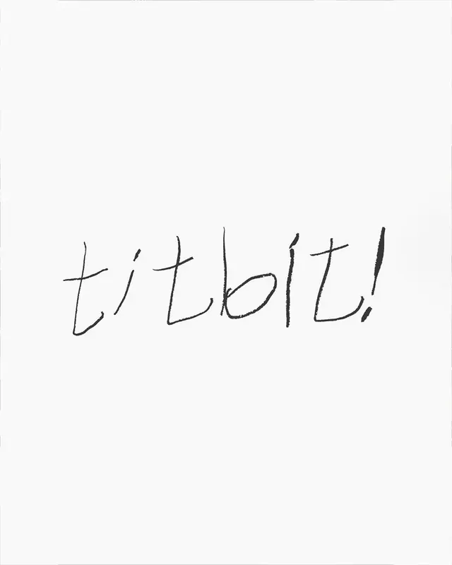
The logo consists of the word titbit followed by an exclamation point in a black, handwritten script. The letters are lowercase and rendered with a thin, slightly irregular line weight on a plain white background.
Key takeaway
Use a raw, handwritten typeface to convey a sense of informality and human touch.
Reuse notes
Reach for this when designing a wordmark for food & drink, e-commerce & dtc. Pairs with playful, elegant identity systems. Original by Maoyoshino.