Preview image. Unlock full-res
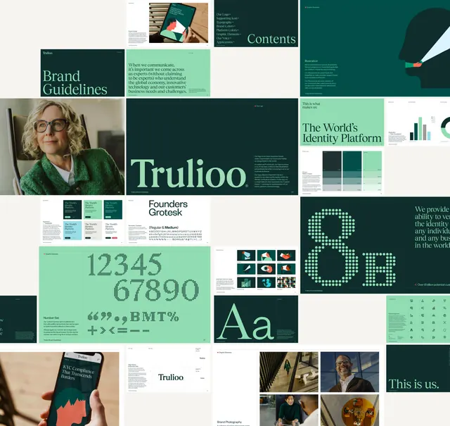
A dense mosaic of Trulioo brand guideline spreads covering logo, colour, typography, illustration, iconography and photography.
More like this
See all


Summary
Roughly thirty guideline spreads tiled into one overview sheet, showing the full Trulioo system from cover and contents through to photography and applications.
Visual description
Spreads of different proportions are packed edge to edge on an off white ground with no visible gutters in places and generous negative space in others. The upper left carries a dark green cover reading "Brand Guidelines" in a pale mint serif, a mint spread of tone of voice copy set in the same serif, and a dark contents page listing logo, supporting icon, typography, brand colors, platform colors, graphic elements, voice and applications. Below sits the logo spread: "Trulioo" set very large in a custom serif wordmark, mint on deep green, with a column of rationale copy at right. Adjacent tiles show colour ladders in five value steps, bar and donut charts in the brand greens, a "Founders Grotesk" secondary typeface specimen with full character set, and a mint page of dot matrix numerals from one to zero with matching punctuation and symbols. Further tiles show a flat illustration of a head in profile with a light beam, a nine up grid of illustration examples, an oversized "8B" built from dots beside the claim about potential customers, a serif "Aa" pairing, an icon sheet of about twenty line marks, clear space and minimum size diagrams over a construction grid, photographs of people in offices and stairwells, a phone showing a KYC compliance headline, and a closing spread reading "This is us."
Key takeaway
Presenting an entire guideline document as one mosaic proves range in a single glance in a way a page by page walkthrough cannot. The system holds because two things recur everywhere: the mint on deep green pairing and the custom serif against a neutral grotesque.
Reuse notes
The best format for the final slide of an identity case study or a portfolio hero. Requires a document with genuine variety, since repeated layouts show up badly at this scale. Individual tiles are illegible at normal viewing size, so pair it with detail frames rather than using it alone.
More like this




Keep what you find
A free account saves references to boards and can send you a weekly email of picks based on what you save.
To see every result, go Pro.