Preview image. Unlock full-res
A creative campaign presenting WorkOS product feature releases as retro CD jewel cases, each with bold typographic cover art and a distinct visual theme.
Summary
A creative campaign presenting WorkOS product feature releases as retro CD jewel cases, each with bold typographic cover art and a distinct visual theme.
Visual description
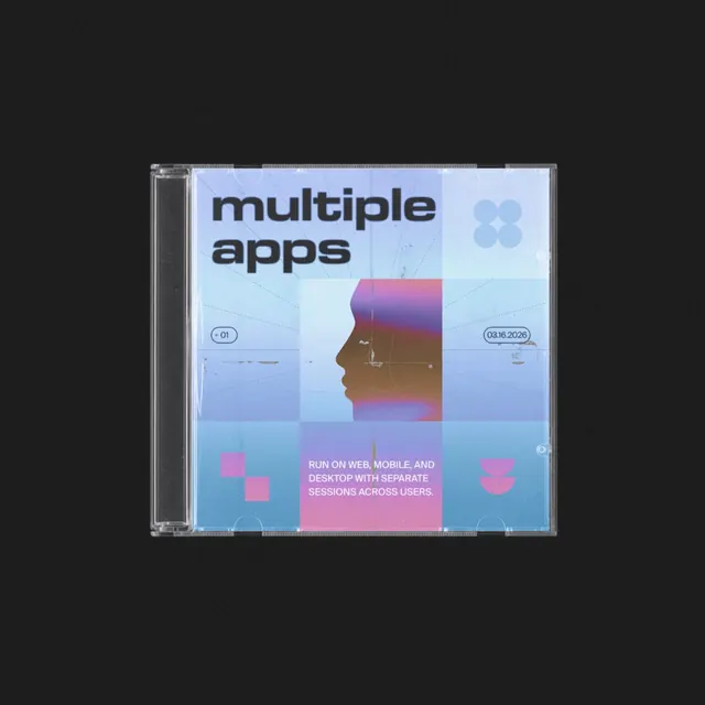
A CD case features a grid-based composition of overlapping rectangular blocks in shades of light blue, dark blue, and pink. The top left contains the bold, lowercase sans-serif text "multiple apps," while a silhouette of a human profile in a warm gradient occupies the center. Small, technical-looking text elements like "01" and "03.16.2026" are placed within small circles, and a block of instructional text sits at the bottom.
Key takeaway
The use of a modular, grid-based layout with overlapping color blocks to create depth and visual interest.
Reuse notes
Reach for this as a identity system reference. Pairs with typographic, experimental directions. Original by Berin Holy.