Preview image. Unlock full-res
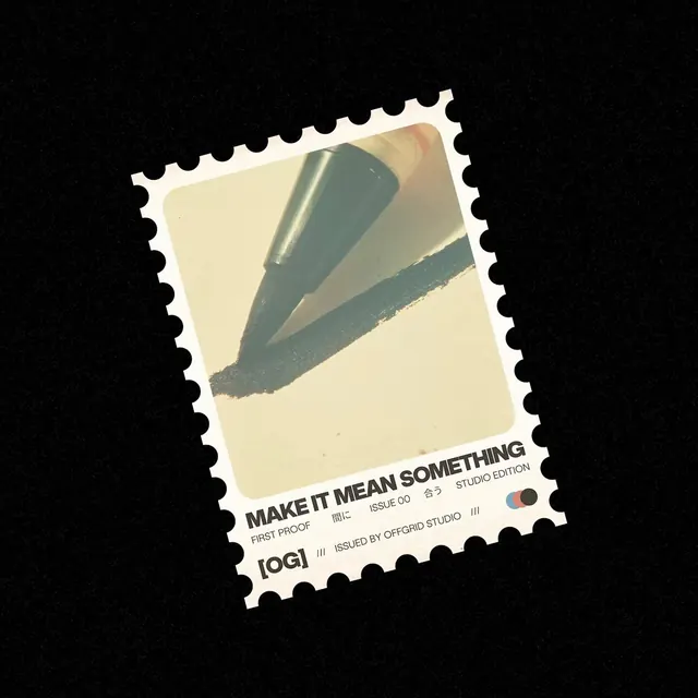
A stamp-like brand identity sequence layers bold type, halftone graphics, and vintage paper textures into a playful animated presentation.
Summary
A stamp-like brand identity sequence layers bold type, halftone graphics, and vintage paper textures into a playful animated presentation.
Visual description
A postage-stamp shaped graphic with perforated edges set against a black background. The top half features a close-up photo of a black marker drawing a thick line on cream paper, while the bottom half contains black sans-serif typography in varying weights and sizes, including Japanese characters. A small rectangular color swatch of blue, red, and grey sits in the bottom right corner.
Key takeaway
Combine a tactile, physical object shape like a postage stamp with a clean, Swiss-style typographic layout.
Reuse notes
Reach for this as a identity system reference. Pairs with typographic, retro directions. Original by Sam Stoof.
More like this


Keep what you find
A free account saves references to boards and can send you a weekly email of picks based on what you save.
To see every result, go Pro.