Preview image. Unlock full-res
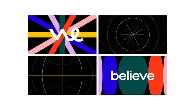
Four black title frames in a two-by-two grid, alternating white script logotype over colour bars with fine geometric line constructions.
More like this
See all
Summary
A sheet of four widescreen title frames on black, pairing a two-part logotype with geometric constructions built from thin coloured lines and thick colour bars.
Visual description
Four equal 16:9 panels sit in a two-by-two grid with white gutters on a white page. Top left: broad diagonal bars in blue, lilac, red, pink, dark green and a horizontal yellow band converge at the centre, with the word "we" set over them in a white connected script whose w is drawn as two joined loops. Top right: on pure black, thin single-weight arcs in red, lilac and teal overlap to form an eye or lens shape, with a small starburst of eight coloured hairlines at its centre. Bottom left: the same hairline vocabulary opens out into a globe-like cage, two pale ellipses crossed by an orange horizontal and vertical axis, all on black. Bottom right: fat vertical lens-shaped columns in lilac, blue, dark green, red and pink fill the panel edge to edge, with the word "believe" across them in white lowercase sans-serif. The two type panels sit diagonally opposite each other.
Key takeaway
One geometric idea, the lens or pointed oval, is run at two extremes: as hairline outlines that read as a technical diagram, and as fat filled columns that read as a colour flag. Splitting the two words of the name across opposite corners implies the sequence they appear in.
Reuse notes
Good reference for brand film title sequences, conference opening frames or identity systems that need a still and a motion state from the same geometry. The hairline panels depend on true black and high resolution; they will alias on compressed video and disappear in print. Pairing a script word with a plain sans word is the risky move here and only holds because both are white and the same optical size.
More like this


Keep what you find
A free account saves references to boards and can send you a weekly email of picks based on what you save.
To see every result, go Pro.