Preview image. Unlock full-res
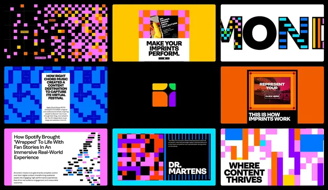
A nine-panel grid of pixelated, colorful design treatments showcasing neon-bright geometric and photographic branding concepts for digital media.
Summary
A nine-panel grid of pixelated, colorful design treatments showcasing neon-bright geometric and photographic branding concepts for digital media.
Visual description
Nine square compositions arranged in a three-by-three grid, each exploring a different bright color palette and design direction. Top row: magenta-and-orange pixelated gradient (left), vibrant yellow background with a white product photo and "MAKE YOUR IMPRINTS PERFORM" headline (center), neon pixelated letters spelling "MONI" in multicolor (right). Middle row: cyan and dark blue pixelated blocks with body copy about music (left), minimal orange and magenta rounded-square logo (center), bright orange background with a nested golden frame and "REPRESENT YOUR CREATIVITY" text (right). Bottom row: hot pink background with headline and colorful bar chart (left), cyan with bright pixelated pattern and "DR. MARTENS" text in white (center), white background with colorful block pattern and "WHERE CONTENT THRIVES" headline (right). Each panel uses bold sans-serif typography and maintains high visual contrast. The overall system demonstrates a range of color-combination strategies and layout approaches suitable for creative industries.
Key takeaway
The pixel-mosaic style creates energetic texture without photorealism. Vibrant neon palettes paired with solid blocks of color are eye-catching and contemporary. Using white backgrounds alongside deep-saturated colors prevents visual fatigue. The nine-panel layout allows exploration of multiple directions while maintaining visual cohesion through shared typographic and geometric language.
Reuse notes
Compelling for creative agencies, media brands, tech startups, and experimental design work. The neon-bright palette reads best on screens and in digital contexts. Works well as a mood board or style guide exploration rather than a single cohesive identity. Some panels prioritize image-over-type while others are type-forward, showing flexibility across different brand applications.