Preview image. Unlock full-res
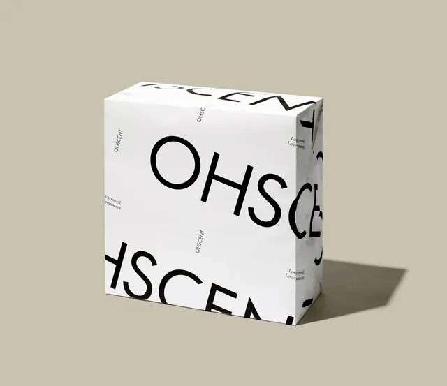
White handcare gift box wrapped in oversized cropped wordmark type and a small repeating tagline pattern.
Summary
A white gift box for a handcare collection wraps the brand's wordmark "OHSCENT" across its faces at a scale so large the letters crop off each edge, paired with a small serif tagline repeated in the gaps.
Visual description
Product photograph of a rectangular white box shot at a three-quarter angle against a warm beige backdrop, with a soft shadow cast to the right. The dominant graphic is the word "OHSCENT" set in a bold, geometric sans-serif and enlarged so far past the box dimensions that each instance is cropped, continuing illegibly onto the adjacent face. Several crops of the wordmark repeat across the front and side panels at different scales and angles. In the negative space, a much smaller instance of "OHSCENT" in the same sans appears right-side up alongside a two-line serif italic tagline, "Love yourself. Love yourscent." A die-cut tab and folded flap are visible at the top edge, confirming this is corrugated retail packaging rather than a rendered mockup.
Key takeaway
Oversized, deliberately cropped wordmark type turns plain packaging into a graphic pattern rather than a label. Scaling the logotype past the container's edges creates texture and shelf presence while a small, correctly oriented version of the same mark stays legible for actual reading.
Reuse notes
Good reference for beauty, personal-care, or lifestyle product packaging that wants a bold, gender-neutral identity system built from typography alone. The cropped-wordmark-as-pattern trick works well anywhere a single word or short name needs to feel like a full graphic system without adding illustration or photography.