Minimalist geometric logo mark

Minimalist geometric logo mark, geometric, minimal, monochrome

Preview image. Unlock full-res

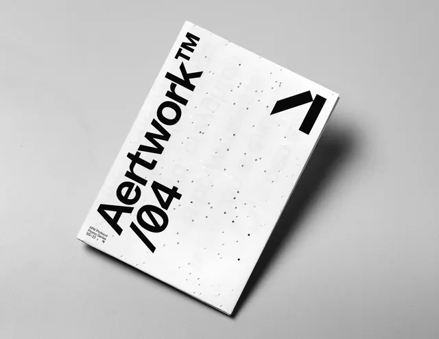
A clean geometric logo design using simple, intersecting shapes and a monochromatic palette, emphasizing symbol clarity and versatility across applications.

Palette
#000000
#FFFFFF
#333333

Summary

A refined geometric logo mark constructed from simple intersecting shapes (likely circles, lines, or rectangles) in strict black and white, designed for maximum scalability and recognizability.

Visual description

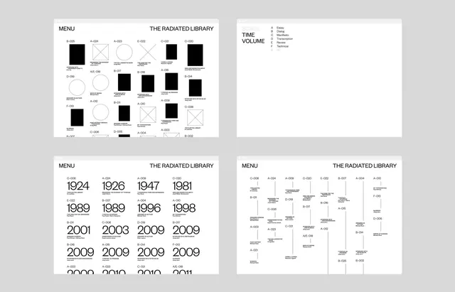
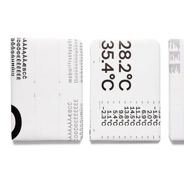
The logo is composed of basic geometric forms—clean lines, circles, or angular shapes—combined to create a unified symbol that reads clearly at any size. The monochromatic palette (black #000000 on white #FFFFFF with gray accents #333333) ensures maximum legibility and practical versatility. The proportions are carefully balanced; no single element dominates, yet the overall composition forms a cohesive, memorable mark. The geometric approach suggests systematic construction, likely built on a grid or compass-based system, allowing for precise reproduction across media. The negative space is as intentional as the positive shapes, creating a sophisticated, modern aesthetic.

Key takeaway

Demonstrates Swiss design principle: function, clarity, and systematic construction over decoration. The geometric restraint ensures the logo remains recognizable at favicon size while elegant at poster scale. Perfect foundation for a cohesive brand system.

Reuse notes

Ideal reference for tech company logos, B2B branding, and any context where professional credibility is paramount. The geometric simplicity ensures reproduction accuracy whether printed or digital, in color or monochrome. The symbol can extend to a complete brand system (secondary marks, icon family, pattern system) while maintaining geometric coherence. Works exceptionally well when reduced to favicon size or used as a favicon itself. The monochromatic design is versatile for stationery, embroidery, and physical applications beyond digital. Consider this when designing a logo intended for long-term relevance and cross-media application.

More like this