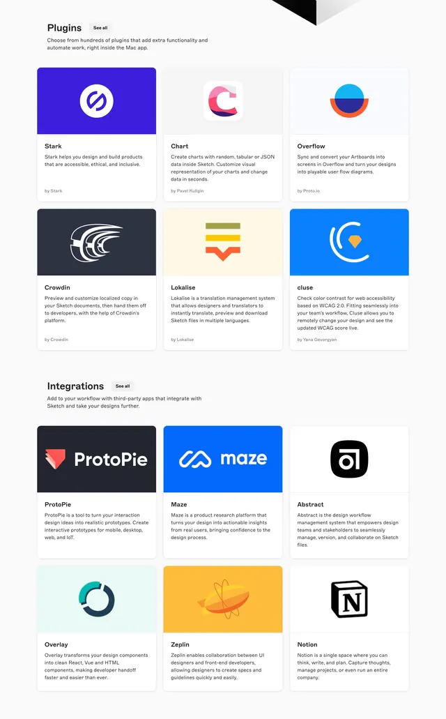
A mixed complementary corporate palette of bright orange primary against teal-mint with a clean gray neutral scale.
Stylecorporate-clean, minimal, light-mode
Colormuted, cool, neon, vibrant, high-contrast
Moodprofessional, trustworthy, friendly, technical
Industrysaas, b2b, developer-tool
TagsCorporate, complementary, mixed, orange, teal, neutral, orange-teal, neutral-scale, two-accent, dashboard, clean-ui, complementary-pop
Palette
#FE6100
#41DEB2
#F2F2F2
#D9D9D9
#B7B7B7
#2B2B2B
A tidy two-accent system: a bright orange primary complemented by a teal-mint, set on a layered light-gray, mid-gray, and silver neutral scale with dark charcoal text. The restrained orange-and-teal pairing on a tonal gray foundation reads clean and modern, with text at AAA. Ideal for SaaS dashboards, B2B product UI, and developer tools that want one warm and one cool accent over a calm neutral system; the disciplined two-pop structure makes it easy to apply consistently.