Preview image. Unlock full-res
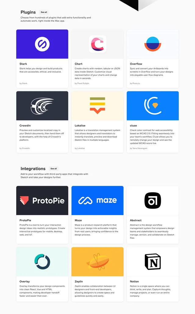
Two stacked 3x2 card grids cataloging Plugins and Integrations with colored header bands, descriptions, and See all buttons.
Summary
Two stacked 3x2 card grids cataloging Plugins and Integrations with colored header bands, descriptions, and See all buttons.
Visual description
White page with Plugins section: title, See all button, intro on automation inside Mac app, and six cards (Stark, Chart, Overflow, Crowdin, Lokalise, cluse) each with colored top band, logo, description, and author credit. Integrations section below mirrors layout with ProtoPie, Maze, Abstract, Overlay, Zeplin, and Notion cards using brand-colored headers and workflow descriptions. Cards use soft shadows on white with consistent typography.
Key takeaway
Repeating one card template across plugins and integrations unifies two related directories. Brand-colored header bands make diverse logos scannable in a dense grid. See all buttons at section level avoid per-card noise.
Reuse notes
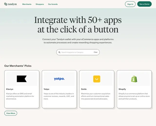
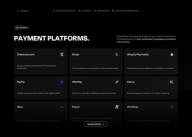
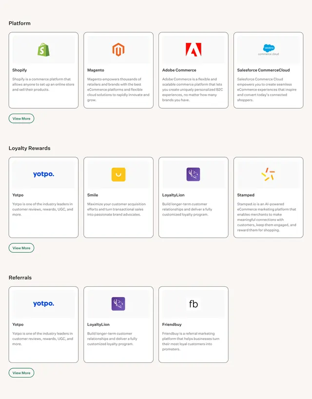
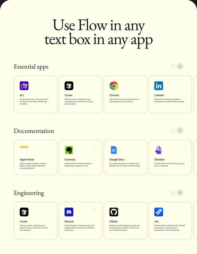
Template for ecosystem or marketplace pages in creative tools. Needs six strong partners minimum per section; weak entries dilute credibility. Header color per partner aids recognition at small card size.
More integrations sections
See all





More like this

Keep what you find
A free account saves references to boards and can send you a weekly email of picks based on what you save.
To see every result, go Pro.