Preview image. Unlock full-res
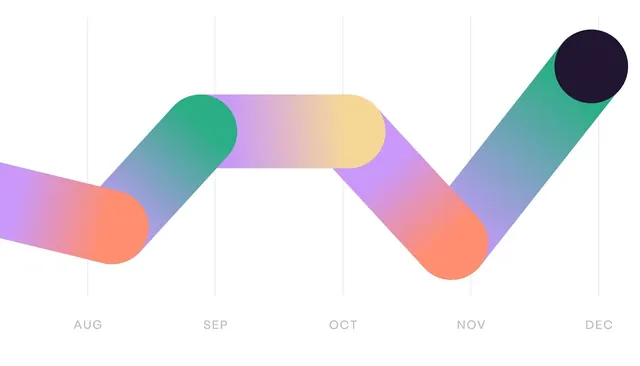
This is a minimalist, timeline-style data visualization using a smooth, flowing ribbon or wave graphic to represent progression over months.
Summary
This is a minimalist, timeline-style data visualization using a smooth, flowing ribbon or wave graphic to represent progression over months.
Visual description
This is a minimalist, timeline-style data visualization using a smooth, flowing ribbon or wave graphic to represent progression over months. The design relies on soft gradients and muted pastel tones, creating a gentle and modern aesthetic. The composition is horizontal, using a continuous, undulating line graph structure to map data across the months. The labels (AUG, SEP, OCT, NOV, DEC) use a clean, sans-serif typeface.
Key takeaway
An infographic reference. Worth saving for its minimalist, gradient, timeline treatment.
Reuse notes
Fits analytics, marketing work.
More like this


Keep what you find
A free account saves references to boards and can send you a weekly email of picks based on what you save.
To see every result, go Pro.