Preview image. Unlock full-res
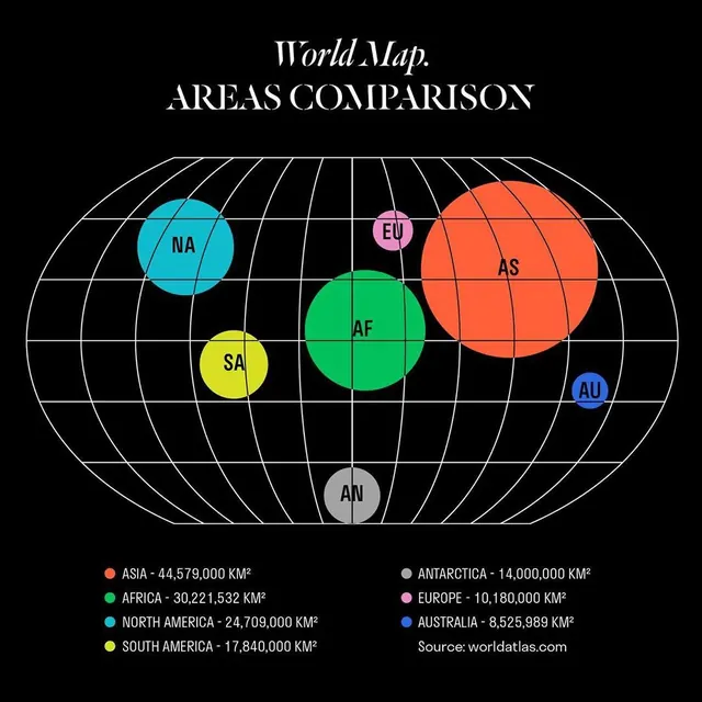
This is a schematic world map comparison infographic using a spherical projection to visually compare the landmasses of continents.
Summary
This is a schematic world map comparison infographic using a spherical projection to visually compare the landmasses of continents.
Visual description
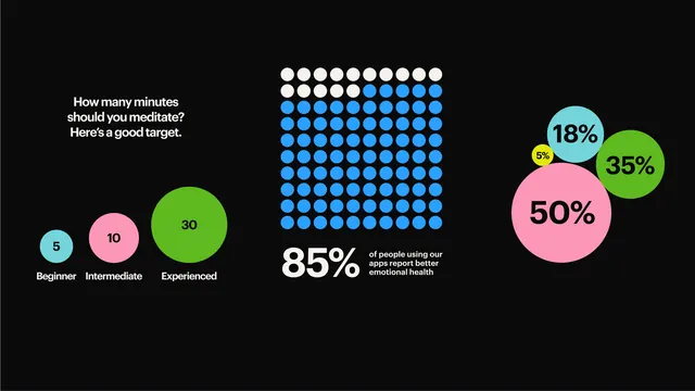
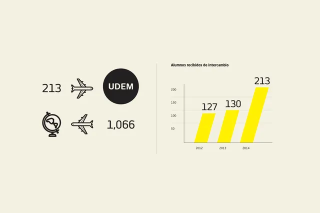
This is a schematic world map comparison infographic using a spherical projection to visually compare the landmasses of continents. The design is clean, utilizing distinct colored circles overlaid on a grid to clearly delineate regional areas. The composition is centered around a circular projection, with labeled regions positioned strategically across the sphere. Clear, sans-serif typeface is used for titles and labels, prioritizing readability.
Key takeaway
An infographic reference. Worth saving for its infographic, diagrammatic, spherical treatment.
Reuse notes
Fits analytics, education work.
More like this

Keep what you find
A free account saves references to boards and can send you a weekly email of picks based on what you save.
To see every result, go Pro.