Preview image. Unlock full-res
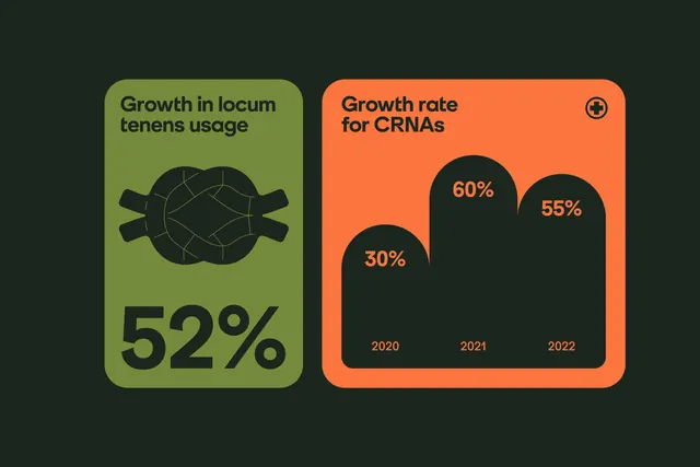
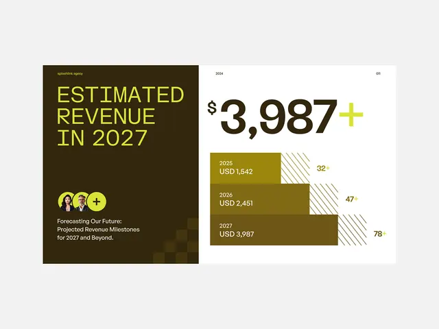
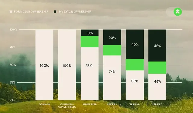
This is a clean, professional data visualization using a minimalist two-panel layout to compare growth metrics.
Summary
This is a clean, professional data visualization using a minimalist two-panel layout to compare growth metrics.
Visual description
This is a clean, professional data visualization using a minimalist two-panel layout to compare growth metrics. The design uses high contrast between muted earthy tones (green and orange) set against a dark background to emphasize key statistics clearly. The visual language is structured and direct, prioritizing readability and analytical clarity. The composition uses a balanced split layout, contrasting two distinct vertical panels to compare different metrics effectively. clean sans-serif fonts are used throughout, ensuring high legibility for both titles and numerical data.
Key takeaway
An infographic reference. Worth saving for its minimalist, infographic, data visualization treatment.
Reuse notes
Fits healthcare work.
More like this


Keep what you find
A free account saves references to boards and can send you a weekly email of picks based on what you save.
To see every result, go Pro.