Preview image. Unlock full-res
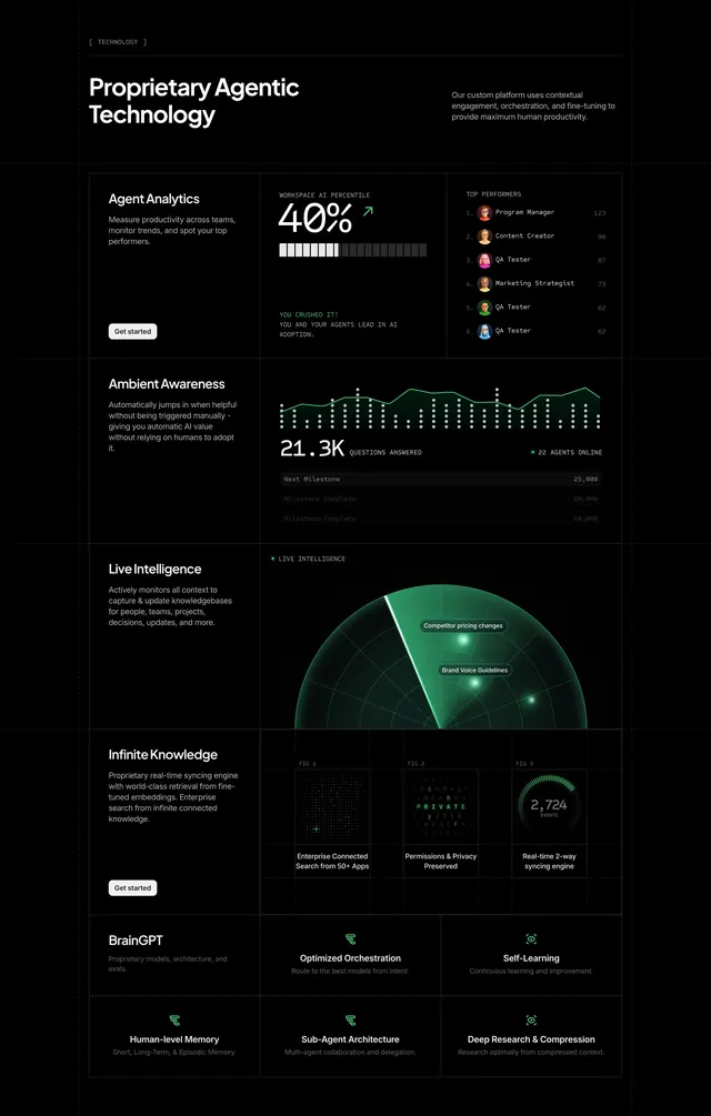
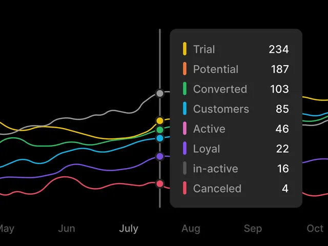
A dark analytics dashboard shows multiple colored trend lines with a large hover tooltip listing segmented counts.
Summary
A dark analytics dashboard shows multiple colored trend lines with a large hover tooltip listing segmented counts.
Visual description
The screen is a black-background line chart with several smooth colored series running horizontally across months labeled along the bottom. A dark rounded tooltip panel overlaps the right side, showing a vertical list of status labels with matching color swatches and right-aligned numeric values.
Key takeaway
Use a floating dark tooltip card with generous padding, rounded corners, and color-coded mini legends to make dense chart states readable at a glance. The strong contrast between the chart lines and the muted panel creates a clean focus hierarchy.
Reuse notes
Reach for this pattern in analytics dashboards when a chart needs detailed breakdowns without cluttering the base visualization. It works best on dark interfaces where hover states can feel like premium product UI rather than a default spreadsheet chart.