Preview image. Unlock full-res
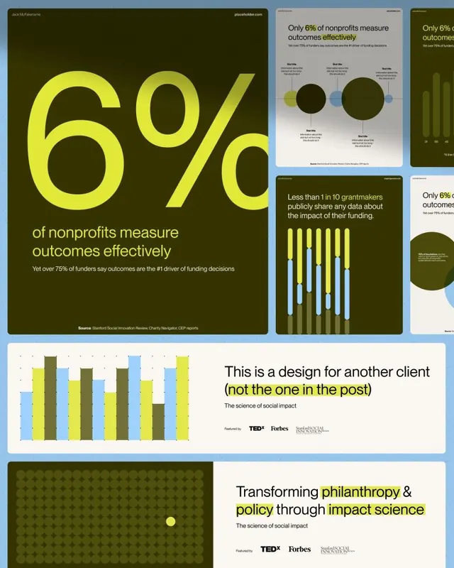
A portfolio mockup showing multiple infographic layouts for a nonprofit impact report, using dark olive green backgrounds with lime-yellow accent type and a mix of bubble charts, grouped bar charts, and KPI callouts.
Summary
A portfolio mockup showing multiple infographic layouts for a nonprofit impact report, using dark olive backgrounds with lime-yellow accent type and charts including bubble charts, grouped vertical bar charts, and a standalone KPI callout.
Visual description
The image presents six infographic compositions arranged as a collage/portfolio overview. The dominant piece in the top-left is a full dark olive-green poster with a massive lime-yellow "6%" KPI in display type, accompanied by a multi-line body stat in white sans-serif reading that over 75% of funders say outcomes are the number-one driver of funding decisions. Source attribution line appears at the bottom in small type. Adjacent smaller thumbnails show: a light-background version of the same stat with a bubble chart (overlapping dark and light circles of varying sizes representing proportional comparison) and a horizontal bar chart variant. A second full-size panel shows a dark olive background with a grouped vertical bar chart (three bar series in olive, lime, and sky-blue, with multiple grouped columns) and a headline about grantmakers sharing impact data. Below the collage, two more full-width compositions appear: a horizontal grouped bar chart on a pale background, and a text-dominant closing panel with the tagline about transforming philanthropy through impact science, with TED, Forbes, and Stanford Social Innovation Review logos.
Key takeaway
The two-color system (dark olive + lime) applied consistently across wildly different chart types gives the whole set instant brand coherence. Reserving lime only for the key statistic in each composition creates a reading hierarchy that works even at thumbnail scale. The oversized-KPI-as-cover-slide convention turns a single percentage into a compelling visual anchor that makes complex supporting charts feel earned.
Reuse notes
Ideal reference for annual report design, grant-funded research publications, or social-impact brand identities that need to feel serious but not corporate. The palette is unusual enough to read as editorial rather than governmental. Works best when one number is undeniably the story; the system breaks if several stats compete for the lime treatment.
More like this
Keep what you find
A free account saves references to boards and can send you a weekly email of picks based on what you save.
To see every result, go Pro.