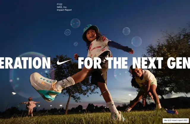
Preview image. Unlock full-res
A 44-slide Nike sustainability and impact report that alternates black photographic section dividers, green big-number infographics, and muted-green data-table and editorial spreads, all under one magazine-style four-pillar running header.
Summary
Nike's FY22 corporate Impact Report, laid out as a 16:9 presentation that reads like a printed annual report. Its personality comes from a strict three-mode rhythm (black photographic dividers, vibrant-green big-number infographics, muted-green data tables and editorial text spreads) held together by a constant four-pillar running header and one repeated targets-table grammar.
Visual description
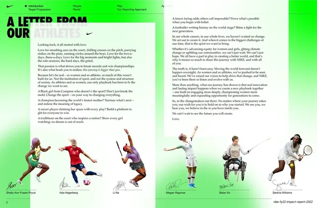
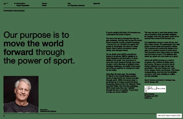
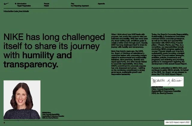
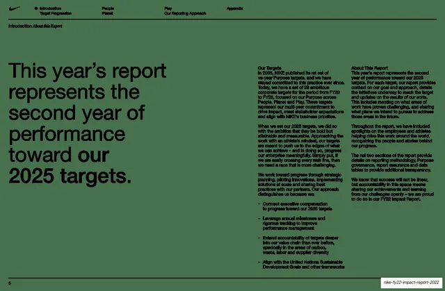
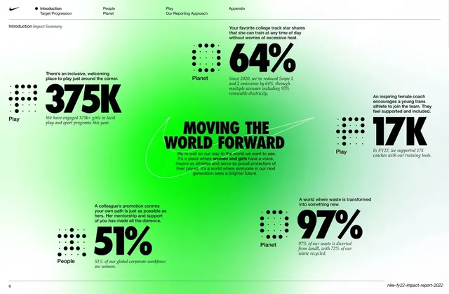
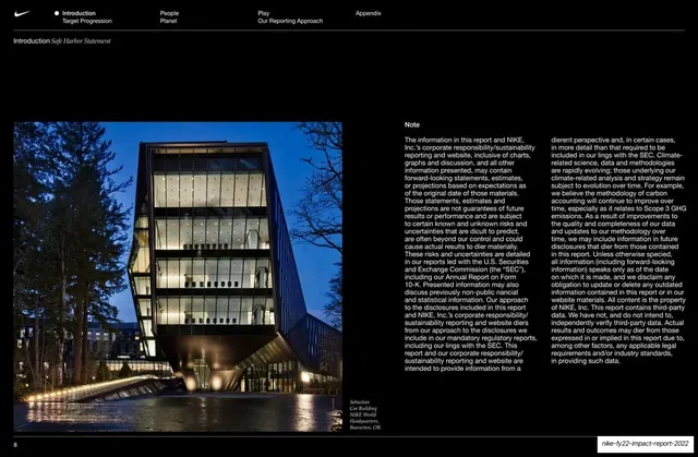
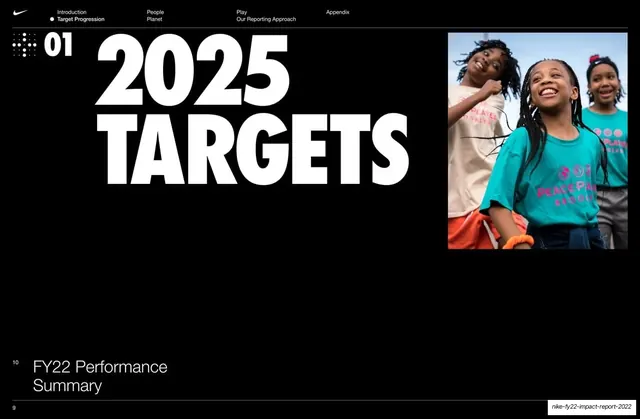
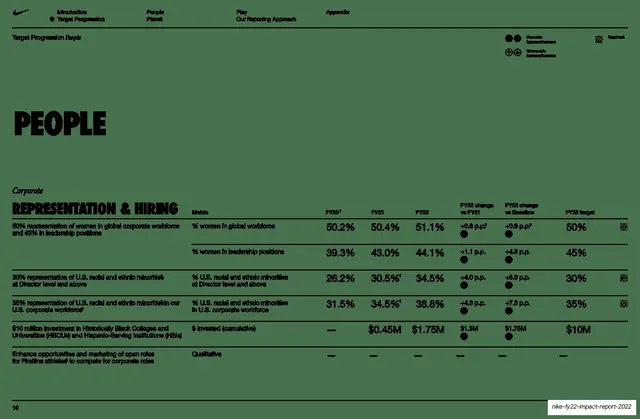
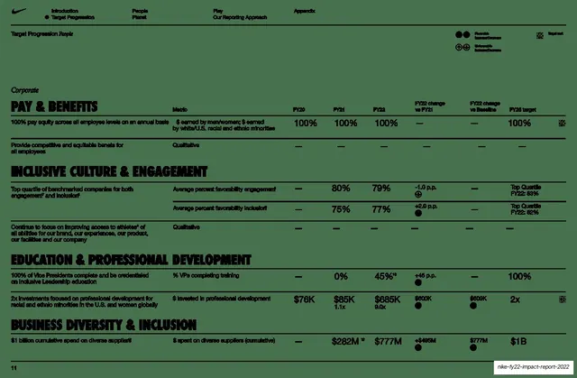
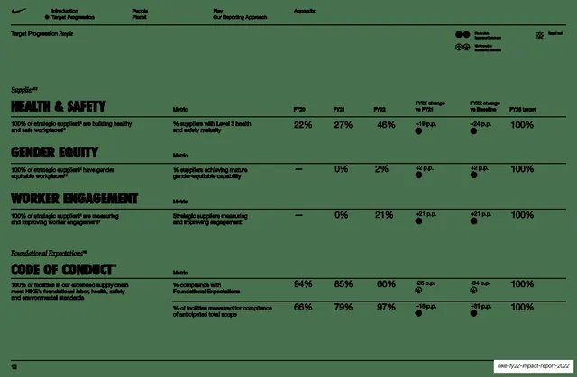
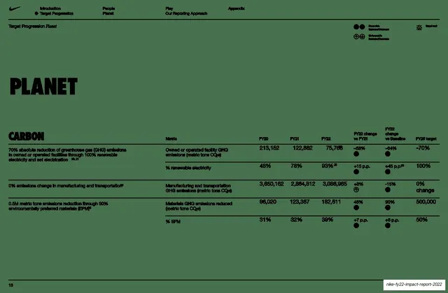
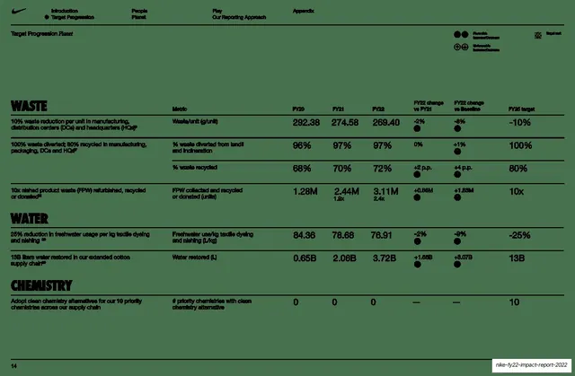
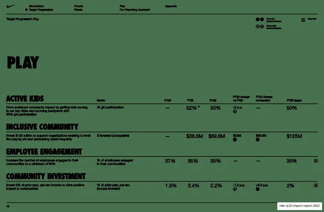
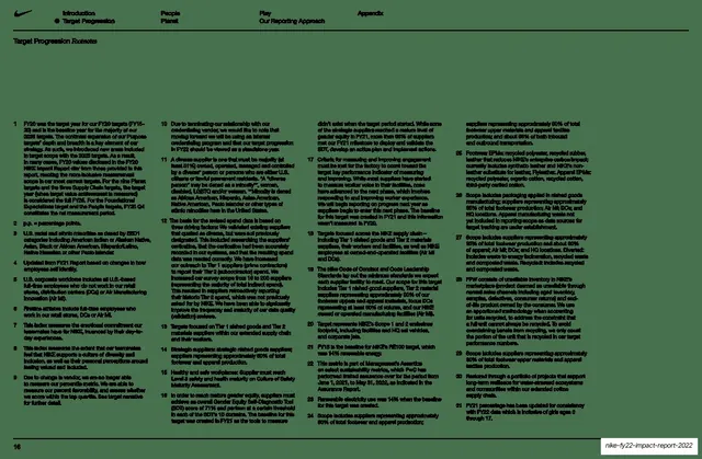
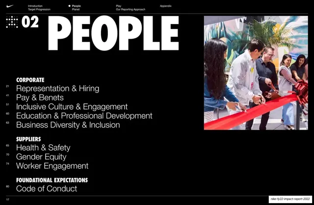
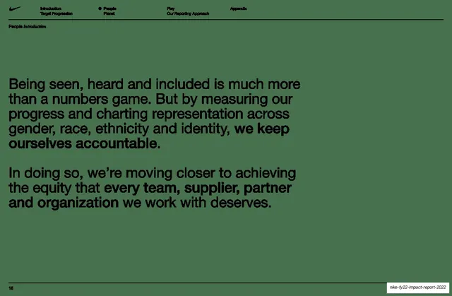
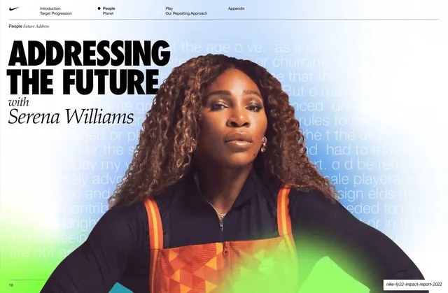
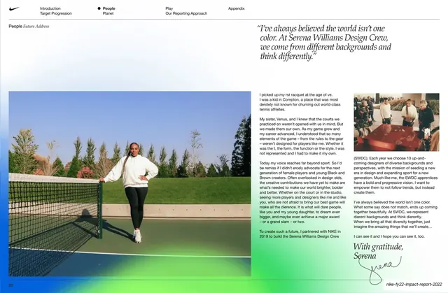
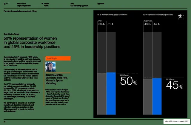
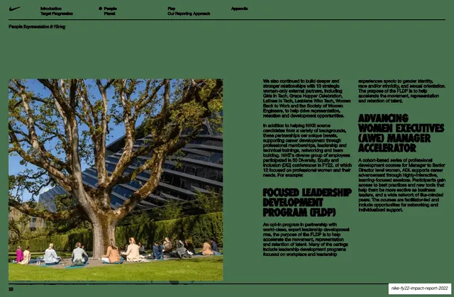
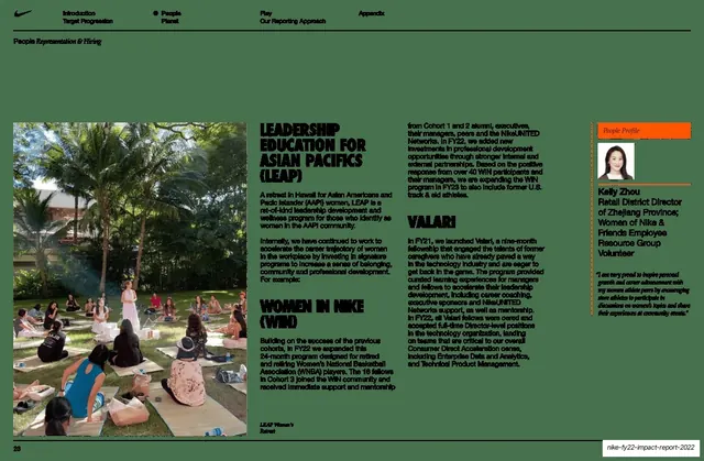
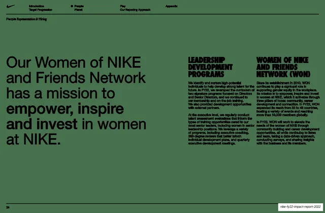
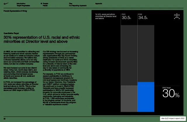
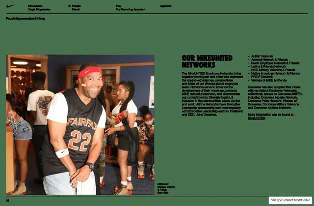
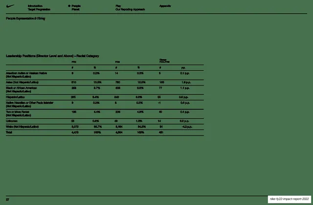
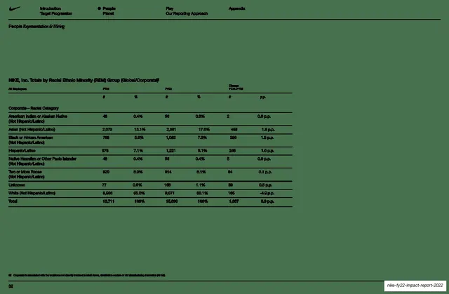
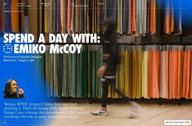
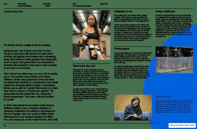
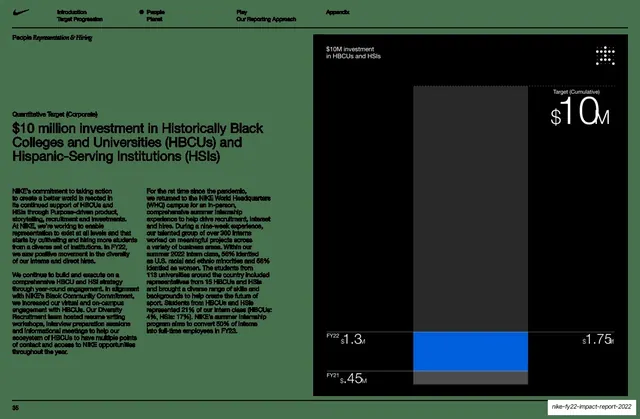
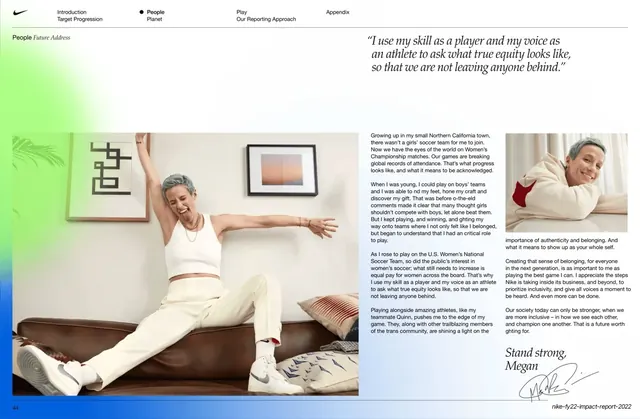
Slides run 16:9 and behave like spreads from a magazine: a persistent running header carries the Nike swoosh top-left and a four-column pillar navigation (Introduction / Target Progression, People / Planet, Play / Our Reporting Approach, Appendix) with an active-state dot, plus a small section line ("Introduction / Letter from John") beneath it, and a page number bottom-left. Three slide modes alternate. First, near-black full-bleed slides: the photographic cover with an oversized white headline broken by the swoosh, and numbered section dividers ("01 2025 TARGETS", "02 PEOPLE") that pair a chapter numeral and a square dot-grid mark with an enormous white condensed-bold caps title and one square or wide color photo, sometimes plus a page-numbered subsection index. Second, vibrant green infographic spreads: the FY22 snapshot scatters six oversized black numbers over a glowing radial-green field around a centered "MOVING THE WORLD FORWARD" swoosh headline. Third, muted grey-green spreads: the editorial pages (CEO and board letters, about-this-report, accountability statements) lead with an oversized black sans headline or pull-quote beside multi-column justified body copy, portraits and handwritten signatures; and the data pages run a single repeated targets table (pillar title in black condensed caps, then goal-on-the-left rows with FY20/FY21/FY22 columns, change-vs-prior and change-vs-baseline columns, a FY25 target, and filled or open status dots against hairline rules and a top-right legend), reused unchanged across People, Planet and Play, with a four-column footnotes spread closing the section. Type throughout is a bold condensed grotesque for headlines and all-caps category heads, regular sans for body, and small italic for captions and section labels. Imagery is athlete and youth-sport photography, full-bleed on the dark slides and cut-out on the athlete letter.
Key takeaway
The three-mode color rhythm that paces a long, dense report: black for chapter breaks and photography, saturated green for the energetic highlight numbers, muted green for the calm reading and data spreads. The constant four-pillar running header that doubles as a table of contents on every slide, so a reader always knows the section. The numbered section-divider system (numeral plus dot-grid mark plus oversized title plus one photo). And the strongest idea: one fixed targets-table grammar (goal stated plainly, year-over-year number grid, single status dot for on-track / off-track) reused identically across every pillar, so a huge scorecard reads as one audited dataset the reader learns once.
Reuse notes
A reference-grade template for any impact, sustainability, ESG, or annual report that has to move between narrative and heavy data, and for any long deck that needs a navigation system and consistent section breaks. The targets-table and the numbered-divider patterns are directly liftable for KPI/OKR scorecards and chaptered decks. It needs genuinely strong athlete or human photography to carry the dark slides, and a saturated brand color for the green infographic to land. The justified multi-column body and tiny footnotes are faithful to a print report but small for on-screen presentation; loosen them if the deck will be read on a screen rather than printed.
From this deck: Nike FY22 Impact Report 2022
View deck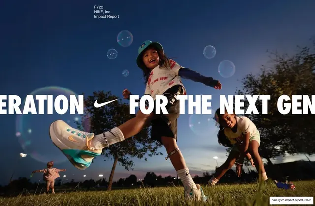
More like this







Keep what you find
A free account saves references to boards and can send you a weekly email of picks based on what you save.
To see every result, go Pro.