Preview image. Unlock full-res
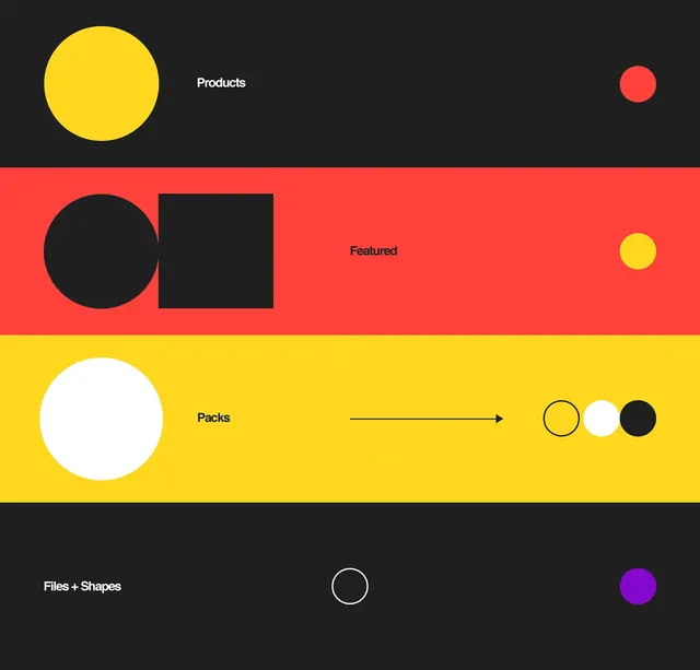
Design system showcase featuring bold geometric shapes and primary colors organized into product categories: Products, Featured, Packs, and Files + Shapes.
Summary
A geometric design system infographic using primary colors and bold shapes to organize product categories with clear visual hierarchy.
Visual description
A horizontal composition divided into four color-blocked sections: dark charcoal, red, bright yellow, and dark. Each section contains sans-serif category text ("Products", "Featured", "Packs", "Files + Shapes") and geometric shapes in contrasting colors. The first section features a large yellow circle and small red circle with white text. The red section contains a large black circle, black rectangle, and small yellow circle. The yellow section has a large white circle, an arrow pointing right, and three small circles in yellow, white, and black outline. The dark section displays "Files + Shapes" text with a white circle outline and purple filled circle. The overall design is bold, scalable, and uses simple geometric primitives (circles, squares, rectangles).
Key takeaway
How primary color blocking and geometric shapes create clarity and memorability in organizing complex information. The reductive approach makes the system versatile and scalable. The playful use of shapes prevents the design system from feeling rigid.
Reuse notes
Excellent template for design systems, product category pages, or organization diagrams. The primary color palette is bold but limited, ensuring consistency. The geometric approach is highly scalable and reproducible. Works well for tech products, apps, or design-forward e-commerce. Could feel childish in some contexts; consider darker color variations for professional applications. The shape language can be applied to various category counts or types.
More like this




Keep what you find
A free account saves references to boards and can send you a weekly email of picks based on what you save.
To see every result, go Pro.