Preview image. Unlock full-res
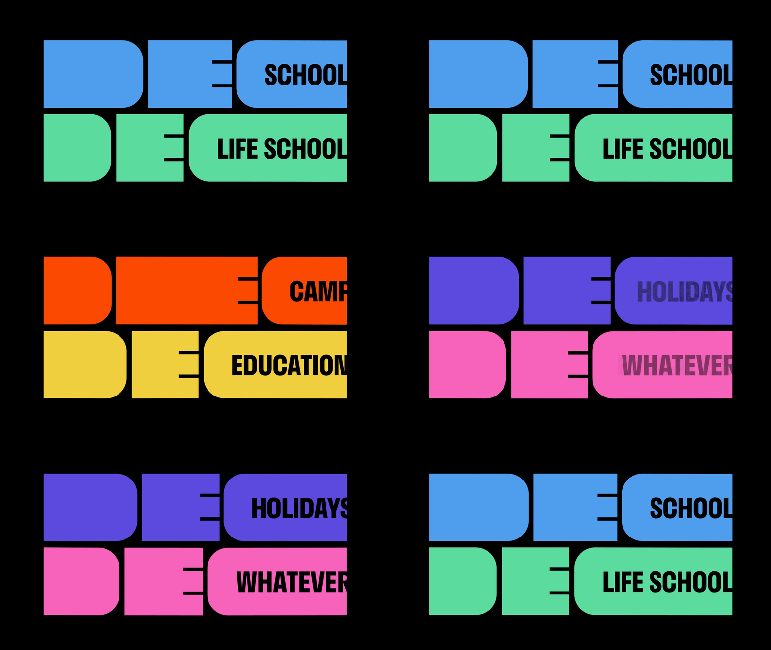
Animated logotype system where rounded DEC lockups stretch horizontally on black while cycling through six colour-coded sub-brands.
More like this
See all
Summary
A flexible logotype that widens on demand: the D, E and C are drawn as solid rounded slabs, and the C opens into a container that holds each sub-brand name.
Visual description
Two lockups sit stacked against a flat black field, each one a single colour with black knocked out of it. The D is a filled rounded rectangle, the E is a block with three cut horizontal bars, and the C extends into a long rounded capsule carrying a sub-brand name in heavy condensed all-caps. Over the loop the marks stretch horizontally, the slabs and the capsule growing wider while the letter heights stay fixed, until the labels run past the right edge of the frame. The colour and label pair swaps as the loop runs: mid blue "SCHOOL" over mint green "LIFE SCHOOL", then orange "CAMP" over yellow "EDUCATION", then violet "HOLIDAYS" over pink "WHATEVER". Nothing else is on screen, so the only events are the stretch and the colour change.
Key takeaway
Building the endorsement slot into the letterform itself means the sub-brand name never needs a separate lockup rule. The width stretch doubles as the animation and as the responsive behaviour, and the one colour per sub-brand keeps a large family legible at a glance.
Reuse notes
Strong model for a parent brand with many named programmes or product lines, particularly in education, events or membership. Needs a genuinely wide colour range to stay distinguishable, and the stretch only works where the layout can give the mark full width; centred or narrow placements lose the effect.
More like this


Keep what you find
A free account saves references to boards and can send you a weekly email of picks based on what you save.
To see every result, go Pro.