Preview image. Unlock full-res
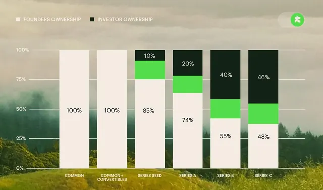
This is a professional, data-driven infographic presenting ownership distribution across different funding series.
Summary
This is a professional, data-driven infographic presenting ownership distribution across different funding series.
Visual description
This is a professional, data-driven infographic presenting ownership distribution across different funding series. The design uses a clean, segmented bar chart format to clearly compare founder versus investor ownership percentages across various stages. The composition is a horizontal bar chart layout, clearly segmenting data vertically across different funding series. The typography is clean and sans-serif, used primarily for labels and axis markings.
Key takeaway
An infographic reference. Worth saving for its infographic, data visualization, bar chart treatment.
Reuse notes
Fits fintech work.
More like this
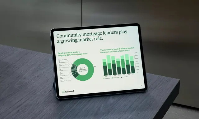
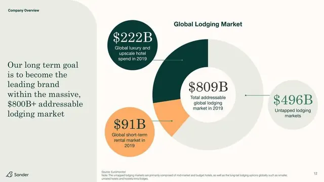
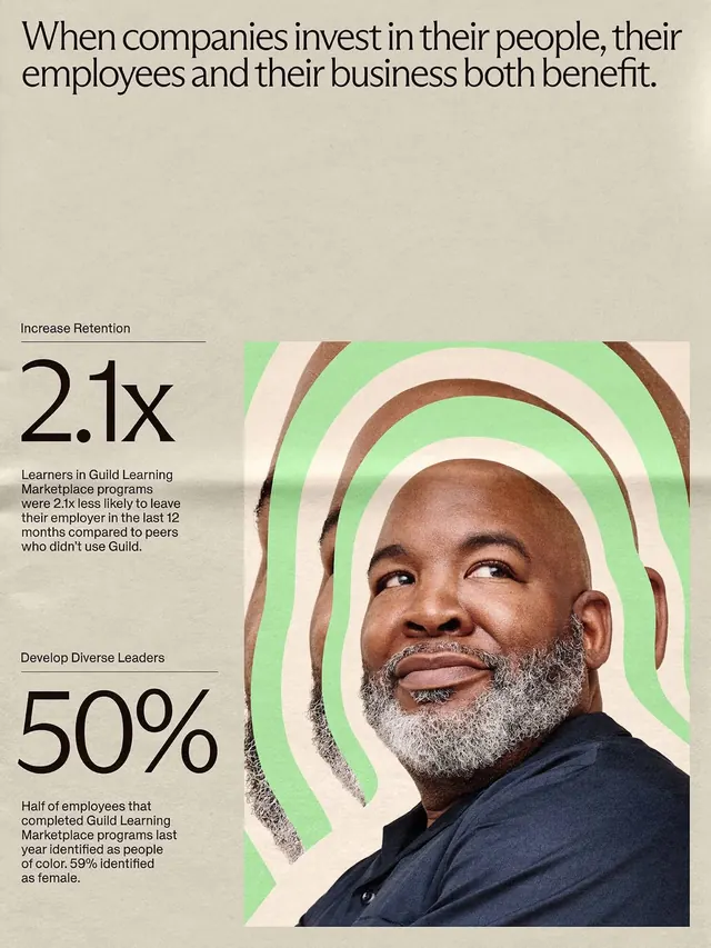

Keep what you find
A free account saves references to boards and can send you a weekly email of picks based on what you save.
To see every result, go Pro.