Preview image. Unlock full-res
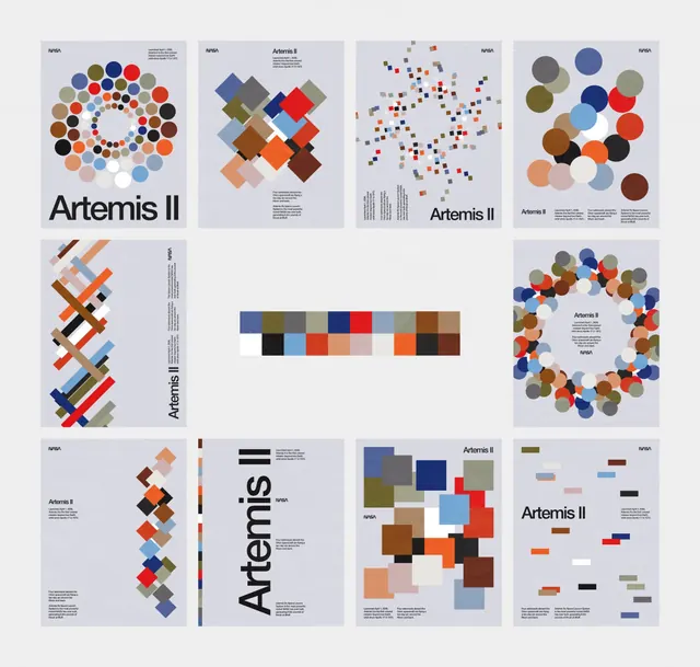
A twelve-poster series visualizing NASA Artemis II mission data through abstract geometric shapes -- circles, squares, and rectangles -- arranged using Swiss grid principles on pale gray backgrounds.
Summary
A twelve-poster series visualizing NASA Artemis II mission data as abstract geometric shapes -- circles, squares, and rectangles -- arranged using Swiss grid principles on uniform pale gray backgrounds, with "Artemis II" set in bold condensed sans-serif at the base of each.
Visual description
Twelve A4-proportion posters displayed in a 4x3 grid against a white background. Each poster shares the same structure: pale gray (#EEEE-range) background, NASA logotype top-left, small body copy top-right, large geometric data encoding centered, and "Artemis II" in bold condensed black sans-serif at the lower-left. The data encoding varies systematically across the series -- each poster uses a different geometric primitive. Row 1: a radial bubble chart of multicolor circles of varying sizes arranged in a ring (the palette spans terracotta, navy, olive, rust, taupe, white, black), a diamond-pattern treemap of overlapping rotated squares in earth tones, a scatter plot of small colored squares dispersing outward from center density, and a circle-pack of large overlapping spheres in muted tones. Row 2: a diagonal stacked-bar-like strip of colored rectangles in chevron formation, a horizontal color-swatch grid strip centered in the composition (serving as a palette reference across the series), and a large radial ring of circles closely packed. Row 3: four posters showing further geometric variants including stacked horizontal bar sequences, a vertical timeline strip of colored blocks, a larger scatter field of colored squares, and a rectangular block mosaic. A center panel in row 2 shows only the color swatch grid, functioning as a legend for the entire series.
Key takeaway
Using a single geometric primitive per poster and varying only size, color, and position is a powerful constraint that makes a series feel rigorously designed rather than arbitrary. The fixed typographic anchor ("Artemis II" plus the NASA mark) provides structural consistency that lets the data encoding range freely. The muted earthy palette unified across all twelve posters ensures the set reads as a system even when individual charts look nothing alike.
Reuse notes
Strong reference for science communication, exhibition posters, annual report covers, and data-art series where brand consistency and visual variety must coexist. The Swiss-grid poster format is well-suited to print. The geometric encoding approach works best when the underlying data is genuinely multivariate -- a single KPI would not justify twelve variations.