Preview image. Unlock full-res
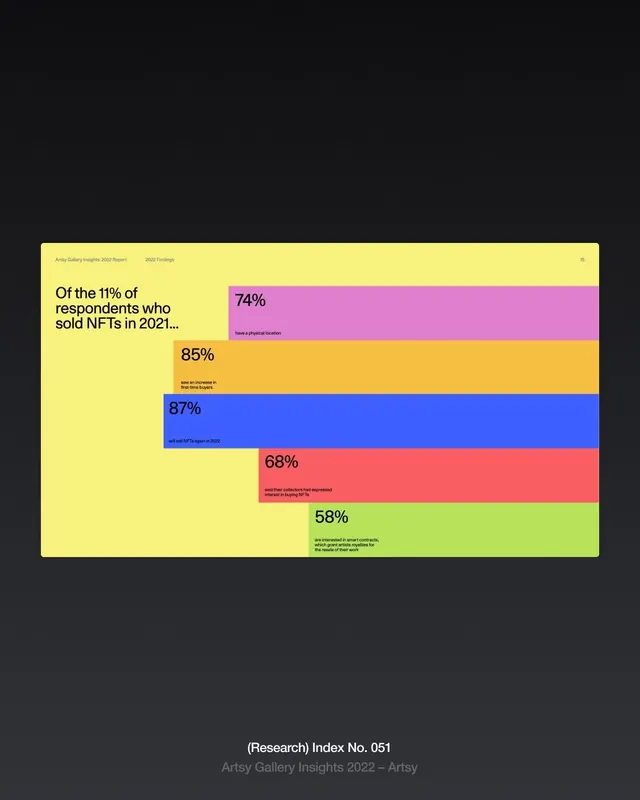
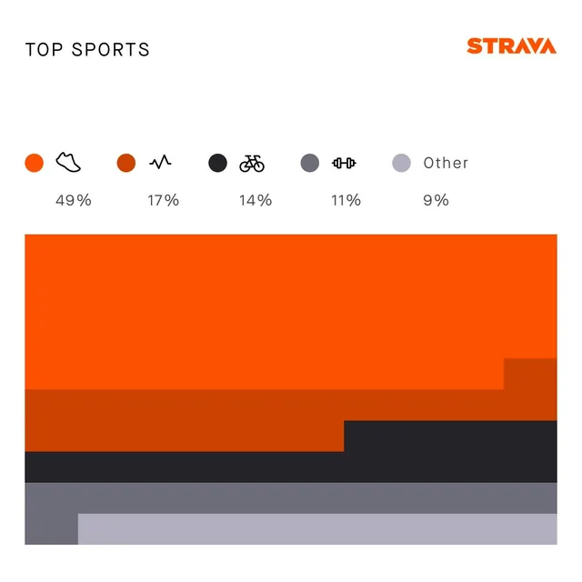
A bold, data-driven infographic using a horizontal stacked bar chart with vibrant, contrasting colors to display NFT sales statistics from 2021.
Summary
A bold, data-driven infographic using a horizontal stacked bar chart with vibrant, contrasting colors to display NFT sales statistics from 2021.
Visual description
A bold, data-driven infographic using a horizontal stacked bar chart with vibrant, contrasting colors to display NFT sales statistics from 2021. The design employs a minimalist layout with clear typography and percentage labels, set against a dark background that emphasizes the colorful data visualization. Horizontal stacked bar chart with left-aligned text label and right-aligned percentage values, centered composition on dark background. Sans-serif typeface, clean and legible; appears to be a modern geometric font for headers and data labels
Key takeaway
An infographic reference. Worth saving for its infographic, data visualization, minimalist treatment.
Reuse notes
Fits general design work.
More like this
Keep what you find
A free account saves references to boards and can send you a weekly email of picks based on what you save.
To see every result, go Pro.