Preview image. Unlock full-res
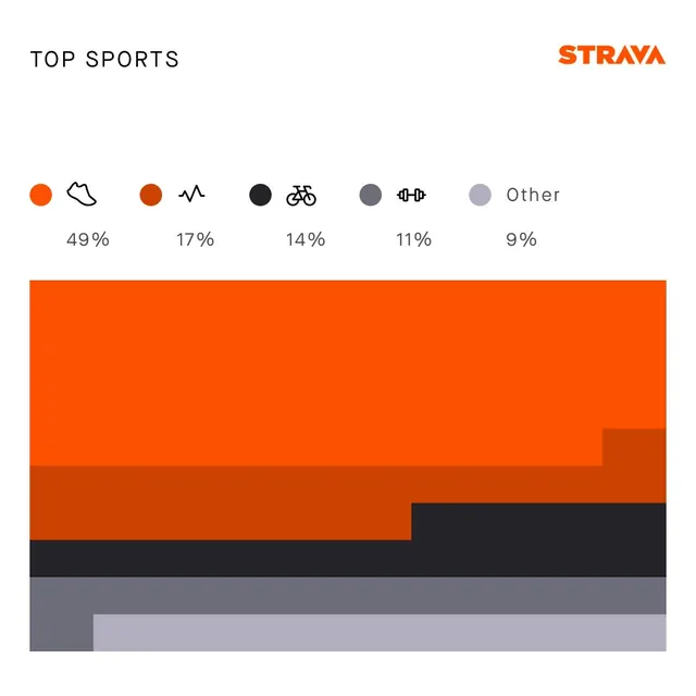
A clean, data-driven infographic displaying sports participation statistics with a bold, modern aesthetic.
Summary
A clean, data-driven infographic displaying sports participation statistics with a bold, modern aesthetic.
Visual description
A clean, data-driven infographic displaying sports participation statistics with a bold, modern aesthetic. The design uses a horizontal stacked bar chart with icon-based category labels and percentage breakdowns, employing Strava's signature orange branding alongside a neutral grayscale palette. Horizontal composition with icon legend at top, percentage labels below, and stacked bar chart dominating the lower two-thirds with cascading segments. Sans-serif typeface, likely a geometric or humanist sans; clean, legible, and corporate in tone
Key takeaway
An infographic reference. Worth saving for its data visualization, minimalist, sports analytics treatment.
Reuse notes
Fits general design work.
More like this

Keep what you find
A free account saves references to boards and can send you a weekly email of picks based on what you save.
To see every result, go Pro.