Preview image. Unlock full-res
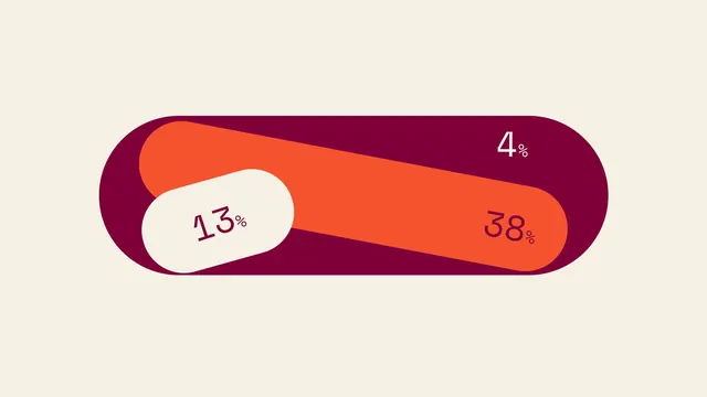
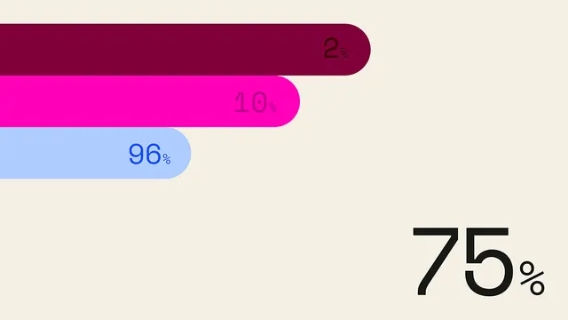
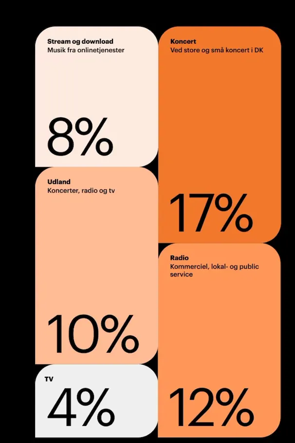
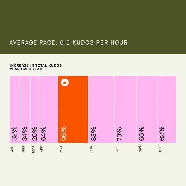
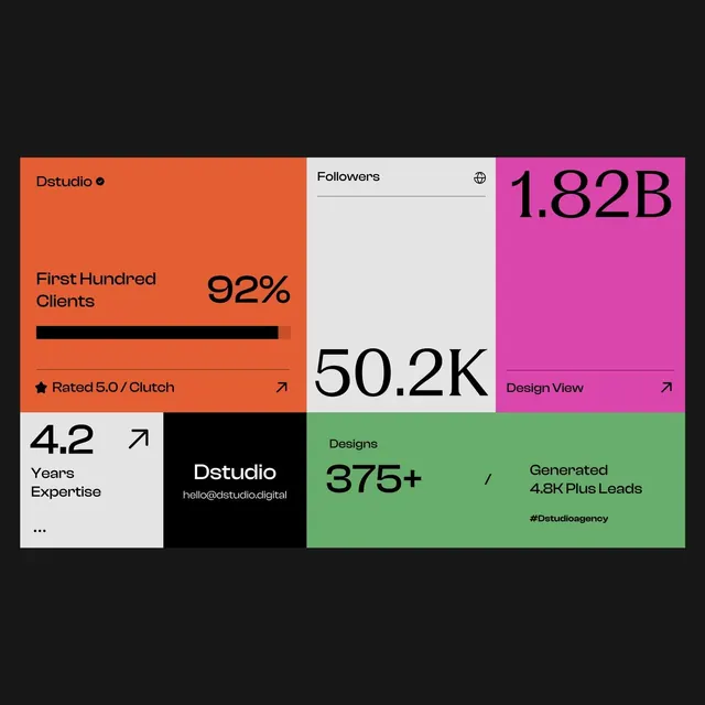
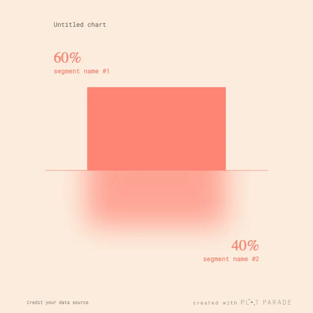
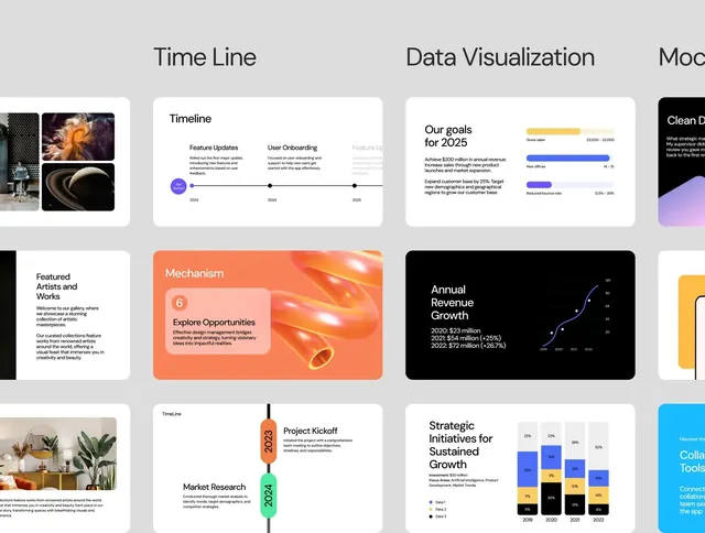
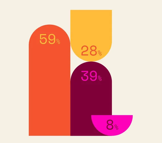
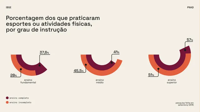
The infographic uses a clean, minimalist design with a muted, earthy color palette to present statistical data clearly.
Summary
The infographic uses a clean, minimalist design with a muted, earthy color palette to present statistical data clearly.
Visual description
The infographic uses a clean, minimalist design with a muted, earthy color palette to present statistical data clearly. The use of curved bar charts effectively visualizes the percentage distribution across different levels of physical activity instruction. The layout is horizontal and segmented, using distinct curved shapes to compare different categories side-by-side. Clean, sans-serif typeface is used for labels and text, prioritizing readability.
Key takeaway
A data viz reference. Worth saving for its minimalist, data visualization, clean treatment.
Reuse notes
Fits general design work.