
Preview image. Unlock full-res
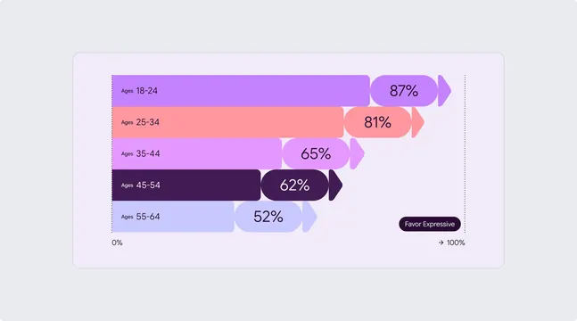
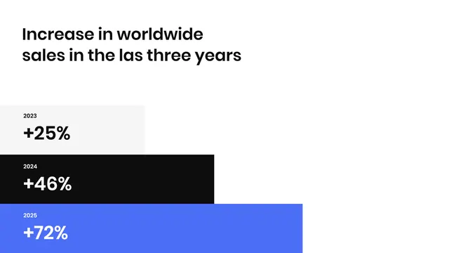
The image presents a clean, minimalist data visualization using a radial or semi-circular chart to illustrate feature rollout percentages.
Summary
The image presents a clean, minimalist data visualization using a radial or semi-circular chart to illustrate feature rollout percentages.
Visual description
The image presents a clean, minimalist data visualization using a radial or semi-circular chart to illustrate feature rollout percentages. The design relies on simple geometric shapes and a limited color palette to convey progress clearly and professionally. The composition is dominated by a large, light-colored arc chart set against a dark background, with text positioned above and a horizontal axis indicator at the bottom. Sans-serif, clean, and highly legible for titles and percentage labels.
Key takeaway
An infographic reference. Worth saving for its minimalist, data visualization, clean treatment.
Reuse notes
Fits analytics work.
More like this






Keep what you find
A free account saves references to boards and can send you a weekly email of picks based on what you save.
To see every result, go Pro.