Preview image. Unlock full-res
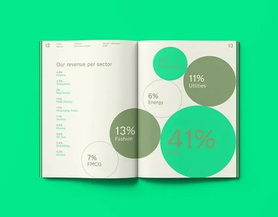
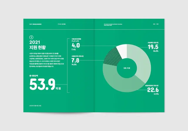
This is a clean, professional infographic presenting revenue distribution across different sectors using a modern, flat design aesthetic.
Summary
This is a clean, professional infographic presenting revenue distribution across different sectors using a modern, flat design aesthetic.
Visual description
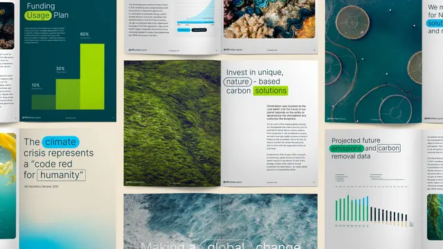
This is a clean, professional infographic presenting revenue distribution across different sectors using a modern, flat design aesthetic. The use of large, vibrant circles effectively visualizes the proportions, creating a clear and digestible data presentation. The layout is a two-page spread featuring a clear division between the left page (listing sectors) and the right page (displaying percentage breakdowns in circular charts). Sans-serif typeface is used for clear, legible labeling and data presentation.
Key takeaway
An infographic reference. Worth saving for its infographic, flat design, data visualization treatment.
Reuse notes
Fits fintech work.
More like this


Keep what you find
A free account saves references to boards and can send you a weekly email of picks based on what you save.
To see every result, go Pro.