Preview image. Unlock full-res
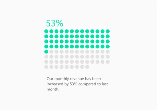
The design is a clean, data-focused infographic using a simple dot chart to visualize a percentage increase.
Summary
The design is a clean, data-focused infographic using a simple dot chart to visualize a percentage increase.
Visual description
The design is a clean, data-focused infographic using a simple dot chart to visualize a percentage increase. It employs a limited, cool color palette and clear typography to convey positive growth metrics effectively. The composition is centered, featuring a prominent percentage figure at the top above a clear visual representation of data points. Simple, sans-serif typeface is used for clarity and readability.
Key takeaway
An infographic reference. Worth saving for its minimalist, data visualization, infographic treatment.
Reuse notes
Fits b2b, fintech, analytics work.
More like this
Keep what you find
A free account saves references to boards and can send you a weekly email of picks based on what you save.
To see every result, go Pro.