Preview image. Unlock full-res
This visualization employs a clean, modular design using horizontal segmented bars to compare performance metrics across different methodologies (e.g., attribute-based vs.
Summary
This visualization employs a clean, modular design using horizontal segmented bars to compare performance metrics across different methodologies (e.g., attribute-based vs.
Visual description
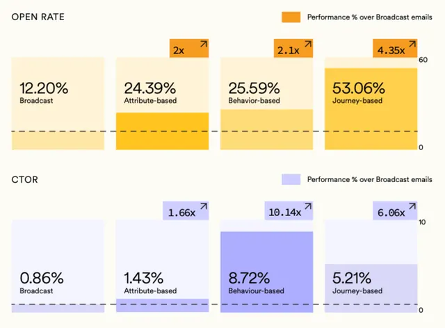
This visualization employs a clean, modular design using horizontal segmented bars to compare performance metrics across different methodologies (e.g., attribute-based vs. journey-based). The visual language is highly structured, relying on color saturation and clear labeling to facilitate rapid comparison of quantitative data. The composition is strictly sectional, using horizontal bar graphs grouped into distinct rows to compare performance categories side-by-side. A simple, clear sans-serif typeface is used throughout, optimized for readability in a dashboard context.
Key takeaway
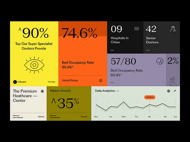
A data viz reference. Worth saving for its data visualization, corporate, clean design treatment.
Reuse notes
Fits general design work.