Preview image. Unlock full-res
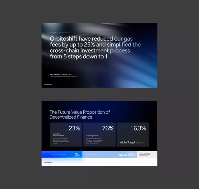
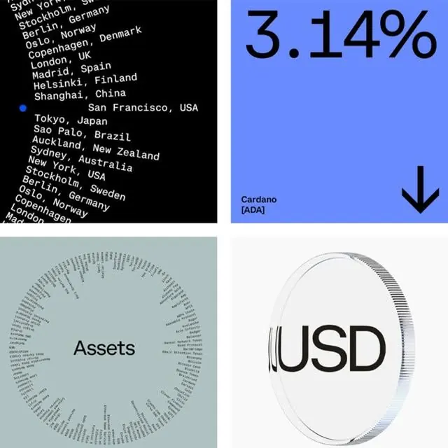
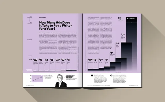
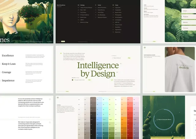
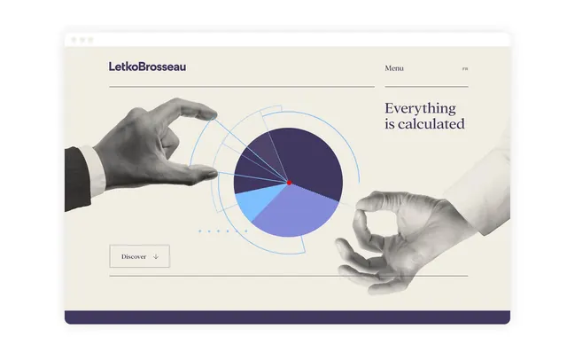
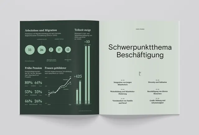
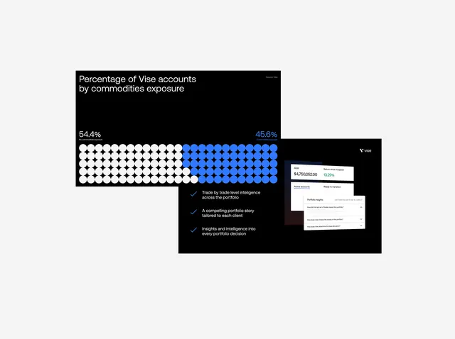
The design utilizes a clean, high-contrast aesthetic common in data visualization dashboards, focusing heavily on conveying complex risk metrics and quantitative results.
Summary
The design utilizes a clean, high-contrast aesthetic common in data visualization dashboards, focusing heavily on conveying complex risk metrics and quantitative results.
Visual description
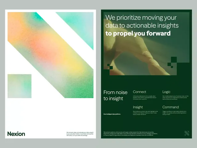
The design utilizes a clean, high-contrast aesthetic common in data visualization dashboards, focusing heavily on conveying complex risk metrics and quantitative results. The visual language is serious, professional, and trustworthy, relying on clear graphical elements to make technical information accessible. The composition is modular and grid-based, arranging diverse screen elements to present related factors in a systematic and organized manner. Clean, highly legible sans-serif fonts are used throughout for maximum clarity and professional presentation.
Key takeaway
A data viz reference. Worth saving for its data visualization, minimalist, corporate treatment.
Reuse notes
Fits fintech work.