Preview image. Unlock full-res
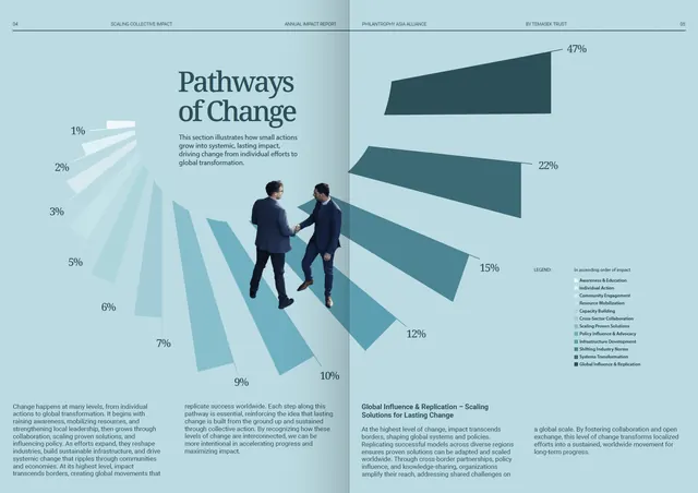
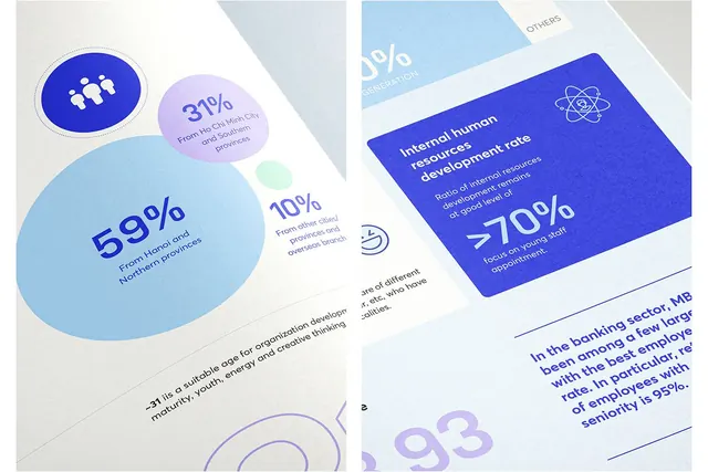
This is a professional, data-driven infographic utilizing clean lines and muted blues to illustrate scaling concepts.
Summary
This is a professional, data-driven infographic utilizing clean lines and muted blues to illustrate scaling concepts.
Visual description
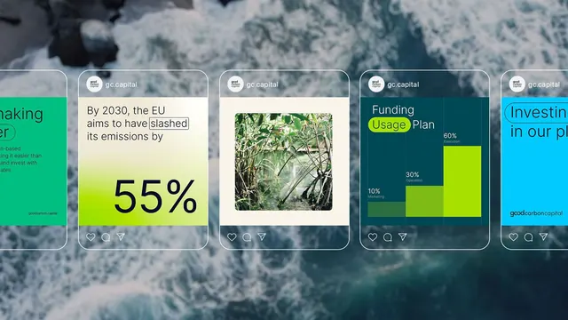
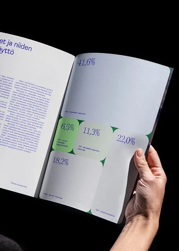
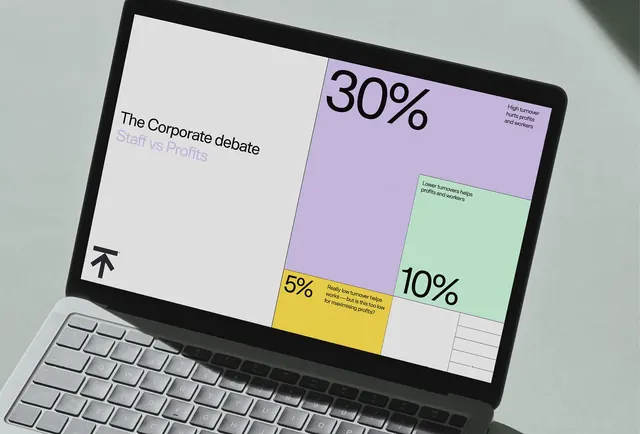
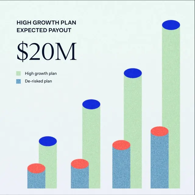
This is a professional, data-driven infographic utilizing clean lines and muted blues to illustrate scaling concepts. The design effectively combines percentage bar charts with stylized human interaction graphics to present complex pathways of change in an accessible, corporate manner. The layout is organized using a clear vertical progression, employing both bar graphs and percentage scales alongside graphic elements to guide the viewer through interconnected concepts. Clean, modern sans-serif fonts are used throughout for maximum readability and a professional tone.
Key takeaway
An infographic reference. Worth saving for its corporate, infographic, data visualization treatment.
Reuse notes
Fits general design work.
More like this
Keep what you find
A free account saves references to boards and can send you a weekly email of picks based on what you save.
To see every result, go Pro.