Preview image. Unlock full-res
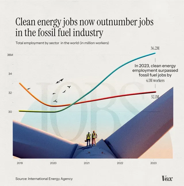
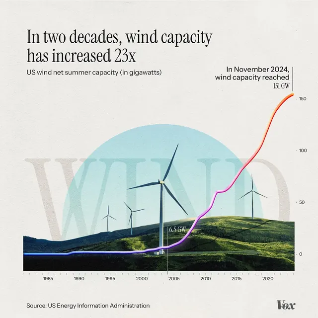
The infographic uses a clean, modern, and optimistic visual language to present data comparing job growth in the clean energy sector against the fossil fuel industry over time.
Summary
The infographic uses a clean, modern, and optimistic visual language to present data comparing job growth in the clean energy sector against the fossil fuel industry over time.
Visual description
The infographic uses a clean, modern, and optimistic visual language to present data comparing job growth in the clean energy sector against the fossil fuel industry over time. The design relies on a simple line graph overlaid on a stylized landscape to create a narrative about transition and positive change. The composition is dominated by a diagonal line graph rising across the frame, set against a muted background and grounded by a stylized landscape. Clear, sans-serif fonts are used for titles and labels, prioritizing readability and a professional tone.
Key takeaway
An infographic reference. Worth saving for its infographic, line graph, minimalist treatment.
Reuse notes
Fits general design work.
More like this
Keep what you find
A free account saves references to boards and can send you a weekly email of picks based on what you save.
To see every result, go Pro.